人気フォント セクションへようこそ。ここでは「よくダウンロードされ、よく使われている」実績ある書体をまとめています。 ロゴ、Web、SNS のどれにも使いやすい、外さない選択肢が見つかります。
どの トップフォント も、バランス・可読性・汎用性で高評価です。 モダン・サンセリフ、エレガントなスクリプト、ヴィンテージなセリフ、ミニマルなディスプレイなどを厳選しています。
-
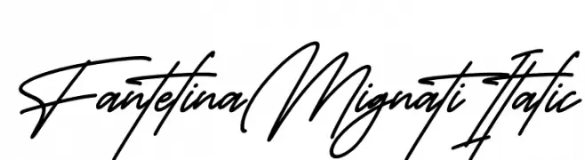
( Fonts by Perspectype Studio - Personal-use only. For commercial use please contact owner. )
A sophisticated and flowing script font with elegant, cursive letterforms.
 ダウンロード 54 ダウンロード数@WebFont
 -
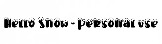
( Fonts by Stefani Letter - Stefani Tri Rosa - Personal-use only. For commercial use please contact owner. )
A bold, snow-capped decorative font perfect for festive designs.
![Hello Snow - Personal use フリーフォントのダウンロード]() ダウンロード 54 ダウンロード数@WebFont
ダウンロード 54 ダウンロード数@WebFont -
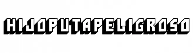
( Fonts by Woodcutter - woodcutter Manero - Personal-use only. For commercial use please contact owner. )
A bold, 3D geometric font with a retro, comic book style.
![HijoPutaPeligroso フリーフォントのダウンロード]() ダウンロード 54 ダウンロード数@WebFont
ダウンロード 54 ダウンロード数@WebFont -
( Fonts by Edric Studio - Personal-use only. For commercial use please contact owner. )
A bold, italicized font with a modern and dynamic appearance.
![FORNEVER DEMO Italic フリーフォントのダウンロード]() ダウンロード 54 ダウンロード数@WebFont
ダウンロード 54 ダウンロード数@WebFont -
( Fonts by Geronimo Fonts - Personal-use only. For commercial use please contact owner. )
A playful, handwritten font with rounded edges and a casual flow.
![Rock Salmon フリーフォントのダウンロード]() ダウンロード 54 ダウンロード数@WebFont
ダウンロード 54 ダウンロード数@WebFont -
-
( Fonts by NJ Studio - Personal-use only. For commercial use please contact owner. )
A lively, expressive handwritten font with fluid cursive strokes and playful loops.
![Masterbaker フリーフォントのダウンロード]() ダウンロード 54 ダウンロード数@WebFont
ダウンロード 54 ダウンロード数@WebFont -
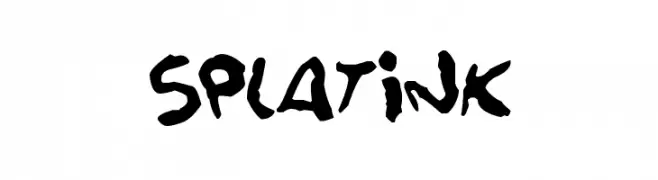
( Fonts by Darrell Flood - Personal-use only. For commercial use please contact owner. )
A bold, hand-painted style font with dynamic, irregular strokes.
![Splatink フリーフォントのダウンロード]() ダウンロード 54 ダウンロード数@WebFont
ダウンロード 54 ダウンロード数@WebFont -
( Fonts by AminMario - Amin Mario - Personal-use only. For commercial use please contact owner. )
A modern, elegant handwritten font with fluid, cursive letterforms.
![Athena River フリーフォントのダウンロード]() ダウンロード 54 ダウンロード数@WebFont
ダウンロード 54 ダウンロード数@WebFont -
( Pixel Kitchen )
Intricate geometric pattern with interlocking shapes for decorative use.
![Zigourat Regular フリーフォントのダウンロード]() ダウンロード 54 ダウンロード数@WebFont
ダウンロード 54 ダウンロード数@WebFont -
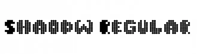
( Fonts by ShadowOnTheLoose )
A pixelated, retro-style font with a bold, blocky appearance.
![Shaodw Regular フリーフォントのダウンロード]() ダウンロード 54 ダウンロード数@WebFont
ダウンロード 54 ダウンロード数@WebFont


今のトップフォントは?
は、クリーンな造形と広い適用範囲で支持を集めています。 ブランディングからランディングページ、ポスターまで活躍します。
ロゴで人気のフォントは?
幾何学系の サンセリフ(例: Poppins、Gotham 系のファミリー)は、スケーラブルでクリーンな印象に最適。 親しみやすさを出すなら スクリプト や手書き系も定番です。 見出しは力強く、本文はニュートラルに──この組み合わせが認知とバランスを高めます。
人気リストはどのくらいの頻度で更新される?
ダウンロード数やエンゲージメントに基づき定期的に更新します。 こまめにチェックして、次に流行るフォントを先取りしましょう。
💡 ヒント: このページをブックマークしておくと便利です。トレンドは速く、今のトップが明日のリブランディングを導くこともあります。