人気フォント セクションへようこそ。ここでは「よくダウンロードされ、よく使われている」実績ある書体をまとめています。 ロゴ、Web、SNS のどれにも使いやすい、外さない選択肢が見つかります。
どの トップフォント も、バランス・可読性・汎用性で高評価です。 モダン・サンセリフ、エレガントなスクリプト、ヴィンテージなセリフ、ミニマルなディスプレイなどを厳選しています。
-
( Fonts by Kat`s Fun Fonts - Personal-use only. For commercial use please contact owner. )
A decorative collection of Valentine's-themed elements with hearts and flowers.
 ダウンロード 37 ダウンロード数@WebFont
 -
( Fonts by madeDeduk - Personal-use only. For commercial use please contact owner. )
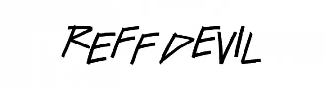
An edgy, angular font with sharp, jagged lines and a rebellious feel.
![ReFf dEvIl フリーフォントのダウンロード]() ダウンロード 37 ダウンロード数@WebFont
ダウンロード 37 ダウンロード数@WebFont -
( LingDong Huang )
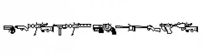
Monochrome pixel art illustrations of firearms in a retro digital style.
![FirearmEncyclope フリーフォントのダウンロード]() ダウンロード 37 ダウンロード数@WebFont
ダウンロード 37 ダウンロード数@WebFont -
( Fonts by Kong Font - https://fontkong.com/ - Personal-use only. For commercial use please contact owner. )
A bold, rounded font with smooth curves and consistent width.
![Donaldson フリーフォントのダウンロード]() ダウンロード 37 ダウンロード数@WebFont
ダウンロード 37 ダウンロード数@WebFont -
( Fonts by Four Lines - zain Fahroni - Personal-use only. For commercial use please contact owner. )
A bold, cursive font with a flowing, handwritten style.
![Sweet Stranger フリーフォントのダウンロード]() ダウンロード 37 ダウンロード数@WebFont
ダウンロード 37 ダウンロード数@WebFont -
-
( Fonts by Pizzadude - Jakob Fischer - Personal-use only. For commercial use please contact owner. )
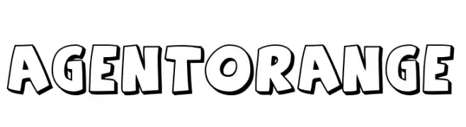
A playful, bold, and outlined font with a cartoonish style.
![Agent Orange フリーフォントのダウンロード]() ダウンロード 37 ダウンロード数@WebFont
ダウンロード 37 ダウンロード数@WebFont -
( Fonts by Khurasan )
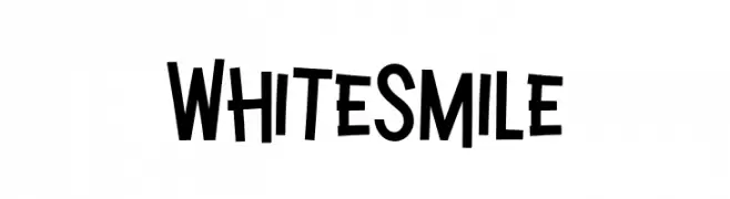
A playful, bold, and hand-drawn style font with irregular strokes.
![White Smile フリーフォントのダウンロード]() ダウンロード 37 ダウンロード数@WebFont
ダウンロード 37 ダウンロード数@WebFont -
( Fonts by Wahyu Eka Prasetya - wepfont.com - Personal-use only. For commercial use please contact owner. )
A bold, textured font with a hand-painted, rugged style.
![Gemah フリーフォントのダウンロード]() ダウンロード 37 ダウンロード数@WebFont
ダウンロード 37 ダウンロード数@WebFont -
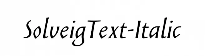
( Fonts by Looseleaf Fonts - Personal-use only. For commercial use please contact owner. )
An elegant italic font with medium contrast and smooth, flowing letters.
![SolveigText-Italic フリーフォントのダウンロード]() ダウンロード 37 ダウンロード数@WebFont
ダウンロード 37 ダウンロード数@WebFont -
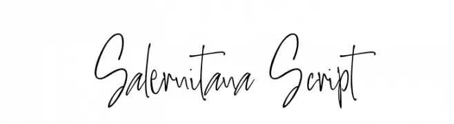
( Fonts by Thirtypath - Personal-use only. For commercial use please contact owner. )
A dynamic, handwritten script with fluid, elongated characters.
![Salernitana Script フリーフォントのダウンロード]() ダウンロード 37 ダウンロード数@WebFont
ダウンロード 37 ダウンロード数@WebFont


今のトップフォントは?
は、クリーンな造形と広い適用範囲で支持を集めています。 ブランディングからランディングページ、ポスターまで活躍します。
ロゴで人気のフォントは?
幾何学系の サンセリフ(例: Poppins、Gotham 系のファミリー)は、スケーラブルでクリーンな印象に最適。 親しみやすさを出すなら スクリプト や手書き系も定番です。 見出しは力強く、本文はニュートラルに──この組み合わせが認知とバランスを高めます。
人気リストはどのくらいの頻度で更新される?
ダウンロード数やエンゲージメントに基づき定期的に更新します。 こまめにチェックして、次に流行るフォントを先取りしましょう。
💡 ヒント: このページをブックマークしておくと便利です。トレンドは速く、今のトップが明日のリブランディングを導くこともあります。