人気フォント セクションへようこそ。ここでは「よくダウンロードされ、よく使われている」実績ある書体をまとめています。 ロゴ、Web、SNS のどれにも使いやすい、外さない選択肢が見つかります。
どの トップフォント も、バランス・可読性・汎用性で高評価です。 モダン・サンセリフ、エレガントなスクリプト、ヴィンテージなセリフ、ミニマルなディスプレイなどを厳選しています。
-
( Fonts by cheerdash co - Personal-use only. For commercial use please contact owner. )
An artistic and dynamic font with flowing, interconnected strokes.
 ダウンロード 37 ダウンロード数@WebFont
 -
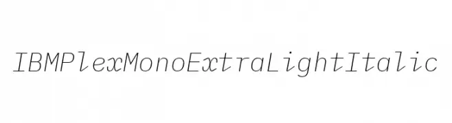
( Fonts by IBM )
A modern, monospaced, extra light italic font with clean lines and uniform spacing.
![IBM Plex Mono ExtraLight Italic フリーフォントのダウンロード]() ダウンロード 37 ダウンロード数@WebFont
ダウンロード 37 ダウンロード数@WebFont -
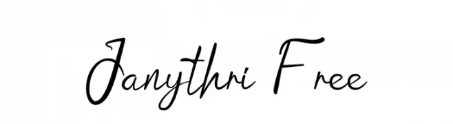
( Fonts by Aditya Rezki Apriyadi - Personal-use only. For commercial use please contact owner. )
A cursive, handwritten-style font with elegant, flowing characters.
![Janythri Free フリーフォントのダウンロード]() ダウンロード 37 ダウンロード数@WebFont
ダウンロード 37 ダウンロード数@WebFont -
( Fonts by Haksen Studio - Sarwo Edhi Prayitno - Personal-use only. For commercial use please contact owner. )
A playful, casual handwritten font with smooth, rounded strokes.
![Great Authorized フリーフォントのダウンロード]() ダウンロード 37 ダウンロード数@WebFont
ダウンロード 37 ダウンロード数@WebFont -
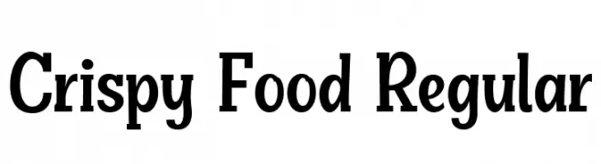
( Fonts by Niskala Huruf - Personal-use only. For commercial use please contact owner. )
A bold serif font with strong, well-defined characters and a modern classic appeal.
![Crispy Food Regular フリーフォントのダウンロード]() ダウンロード 37 ダウンロード数@WebFont
ダウンロード 37 ダウンロード数@WebFont -
-
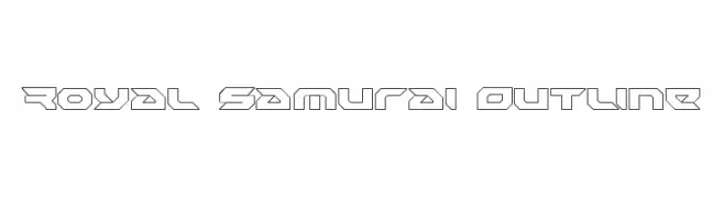
( Iconian Fonts - Daniel Zadorozny - www.iconian.com )
A bold, geometric outline font with a futuristic, sci-fi aesthetic.
![Royal Samurai Outline フリーフォントのダウンロード]() ダウンロード 37 ダウンロード数@WebFont
ダウンロード 37 ダウンロード数@WebFont -
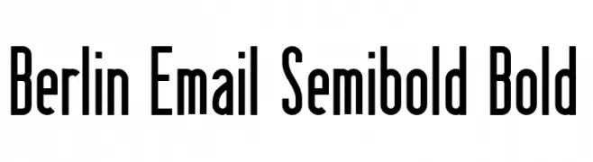
( Fonts by Peter Wiegel - www.peter-wiegel.de - Personal-use only. For commercial use please contact owner. )
A bold, modern font with tall, narrow characters and a sleek design.
![Berlin Email Semibold Bold フリーフォントのダウンロード]() ダウンロード 37 ダウンロード数@WebFont
ダウンロード 37 ダウンロード数@WebFont -
( Fonts by Daniel Zadorozny - www.iconian.com - Personal-use only. For commercial use please contact owner. )
A bold, italicized font with a futuristic and angular design.
![Night Traveler Title Italic フリーフォントのダウンロード]() ダウンロード 37 ダウンロード数@WebFont
ダウンロード 37 ダウンロード数@WebFont -
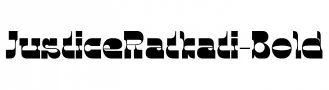
( Fonts by 177studio - Personal-use only. For commercial use please contact owner. )
A bold, geometric font with high contrast and a modern, dynamic style.
![JusticeRatkati-Bold フリーフォントのダウンロード]() ダウンロード 37 ダウンロード数@WebFont
ダウンロード 37 ダウンロード数@WebFont -
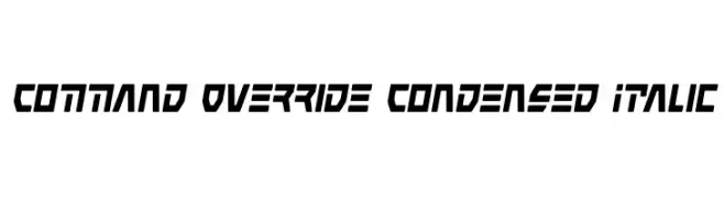
( Iconian Fonts - Daniel Zadorozny - www.iconian.com )
A bold, condensed, and italicized font with a futuristic and angular design.
![Command Override Condensed Italic フリーフォントのダウンロード]() ダウンロード 37 ダウンロード数@WebFont
ダウンロード 37 ダウンロード数@WebFont


今のトップフォントは?
は、クリーンな造形と広い適用範囲で支持を集めています。 ブランディングからランディングページ、ポスターまで活躍します。
ロゴで人気のフォントは?
幾何学系の サンセリフ(例: Poppins、Gotham 系のファミリー)は、スケーラブルでクリーンな印象に最適。 親しみやすさを出すなら スクリプト や手書き系も定番です。 見出しは力強く、本文はニュートラルに──この組み合わせが認知とバランスを高めます。
人気リストはどのくらいの頻度で更新される?
ダウンロード数やエンゲージメントに基づき定期的に更新します。 こまめにチェックして、次に流行るフォントを先取りしましょう。
💡 ヒント: このページをブックマークしておくと便利です。トレンドは速く、今のトップが明日のリブランディングを導くこともあります。