人気フォント セクションへようこそ。ここでは「よくダウンロードされ、よく使われている」実績ある書体をまとめています。 ロゴ、Web、SNS のどれにも使いやすい、外さない選択肢が見つかります。
どの トップフォント も、バランス・可読性・汎用性で高評価です。 モダン・サンセリフ、エレガントなスクリプト、ヴィンテージなセリフ、ミニマルなディスプレイなどを厳選しています。
-
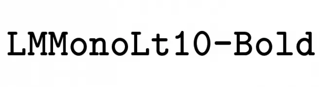
( Fonts by www.gust.org.pl )
A bold, monospaced slab serif font with rounded serifs and uniform character width.
 ダウンロード 5290 ダウンロード数@WebFont
 -
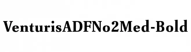
( Fonts by Arkandis Digital Foundry )
A bold, classic serif font with strong, authoritative strokes.
![VenturisADFNo2Med-Bold フリーフォントのダウンロード]() ダウンロード 5289 ダウンロード数@WebFont
ダウンロード 5289 ダウンロード数@WebFont -
![Trek Generation 1 フリーフォントのダウンロード]() ダウンロード 5289 ダウンロード数@WebFont
ダウンロード 5289 ダウンロード数@WebFont -
( Copyright (c) 2010-2014 by tyPoland Lukasz Dziedzic (team@latofonts.com) with Reserved Font Name "Lato" )
A modern, slightly italic typeface with clean lines and moderate contrast.
![Lato Medium Italic フリーフォントのダウンロード]() ダウンロード 5288 ダウンロード数@WebFont
ダウンロード 5288 ダウンロード数@WebFont -
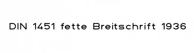
( Fonts by www.peter-wiegel.de. Personal-use only. For commercial use please contact owner. )
A geometric sans-serif font with uniform strokes and high legibility.
![DIN 1451 fette Breitschrift 1936 フリーフォントのダウンロード]() ダウンロード 5288 ダウンロード数@WebFont
ダウンロード 5288 ダウンロード数@WebFont -
-
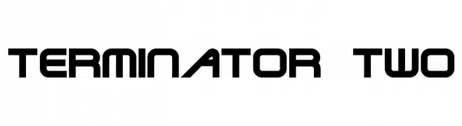
![Terminator Two フリーフォントのダウンロード]() ダウンロード 5288 ダウンロード数
ダウンロード 5288 ダウンロード数 -
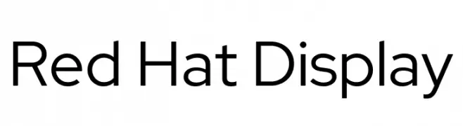
( Copyright 2019 The Red Hat Project Authors (https://github.com/RedHatOfficial/RedHatFont) )
A modern, geometric sans-serif font with clean lines and balanced structure.
![Red Hat Display フリーフォントのダウンロード]() ダウンロード 5287 ダウンロード数@WebFont
ダウンロード 5287 ダウンロード数@WebFont -
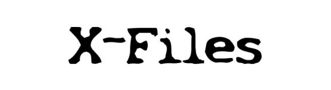
![X-Files フリーフォントのダウンロード]() ダウンロード 5286 ダウンロード数@WebFont
ダウンロード 5286 ダウンロード数@WebFont -
( Fonts by Mickey Rossi - www.subflux.com )
A bold, blocky font with a strong, athletic style.
![Athletic Supporter フリーフォントのダウンロード]() ダウンロード 5285 ダウンロード数@WebFont
ダウンロード 5285 ダウンロード数@WebFont -
![Milford Condensed フリーフォントのダウンロード]() ダウンロード 5283 ダウンロード数@WebFont
ダウンロード 5283 ダウンロード数@WebFont


今のトップフォントは?
は、クリーンな造形と広い適用範囲で支持を集めています。 ブランディングからランディングページ、ポスターまで活躍します。
ロゴで人気のフォントは?
幾何学系の サンセリフ(例: Poppins、Gotham 系のファミリー)は、スケーラブルでクリーンな印象に最適。 親しみやすさを出すなら スクリプト や手書き系も定番です。 見出しは力強く、本文はニュートラルに──この組み合わせが認知とバランスを高めます。
人気リストはどのくらいの頻度で更新される?
ダウンロード数やエンゲージメントに基づき定期的に更新します。 こまめにチェックして、次に流行るフォントを先取りしましょう。
💡 ヒント: このページをブックマークしておくと便利です。トレンドは速く、今のトップが明日のリブランディングを導くこともあります。