人気フォント セクションへようこそ。ここでは「よくダウンロードされ、よく使われている」実績ある書体をまとめています。 ロゴ、Web、SNS のどれにも使いやすい、外さない選択肢が見つかります。
どの トップフォント も、バランス・可読性・汎用性で高評価です。 モダン・サンセリフ、エレガントなスクリプト、ヴィンテージなセリフ、ミニマルなディスプレイなどを厳選しています。
-
 ダウンロード 5282 ダウンロード数@WebFont
 -
( Fonts by www.fontdiner.com )
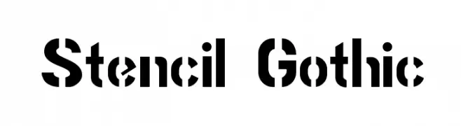
A bold, stencil-style font with geometric uniformity and high legibility.
![Stencil Gothic フリーフォントのダウンロード]() ダウンロード 5282 ダウンロード数@WebFont
ダウンロード 5282 ダウンロード数@WebFont -
![MLB Nationals フリーフォントのダウンロード]() ダウンロード 5280 ダウンロード数@WebFont
ダウンロード 5280 ダウンロード数@WebFont -
( Fonts by www.sursly.com )
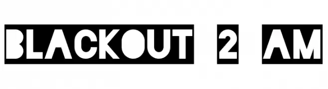
A bold, geometric font with a modern, stencil-like design.
![Blackout 2 AM フリーフォントのダウンロード]() ダウンロード 5279 ダウンロード数@WebFont
ダウンロード 5279 ダウンロード数@WebFont -
( Fonts by Michael Tension - www.TensionType.com )
A bold, distressed font with a rugged, stencil-like appearance.
![Impact Label フリーフォントのダウンロード]() ダウンロード 5275 ダウンロード数@WebFont
ダウンロード 5275 ダウンロード数@WebFont -
-
( Fonts by Jason Arthur - JibbaJabba Fonts - www.myspace.com/jasonarthurloaded )
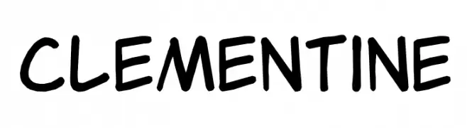
A playful, handwritten-style font with consistent strokes and rounded edges.
![Clementine フリーフォントのダウンロード]() ダウンロード 5273 ダウンロード数@WebFont
ダウンロード 5273 ダウンロード数@WebFont -
( Copyright (c) 2011, Eduardo Tunni (http://www.tipo.net.ar), )
A modern serif typeface with clean lines and balanced proportions.
![Glegoo フリーフォントのダウンロード]() ダウンロード 5272 ダウンロード数@WebFont
ダウンロード 5272 ダウンロード数@WebFont -
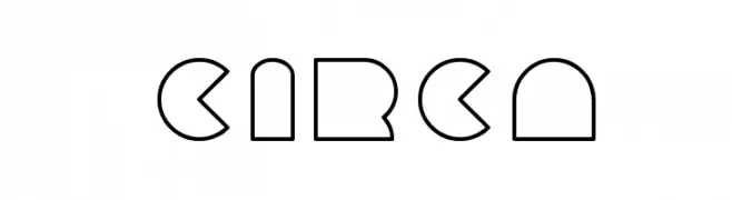
![circa フリーフォントのダウンロード]() ダウンロード 5272 ダウンロード数@WebFont
ダウンロード 5272 ダウンロード数@WebFont -
( Fonts by Castcraft Software - opti.netii.net - check the website before use )
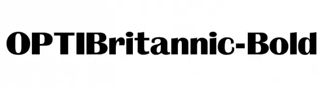
A bold and robust font with strong, thick strokes and a touch of elegance.
![OPTIBritannic-Bold フリーフォントのダウンロード]() ダウンロード 5270 ダウンロード数@WebFont
ダウンロード 5270 ダウンロード数@WebFont -
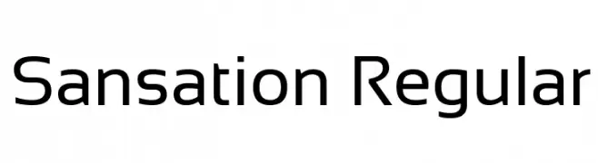
( Copyright (c) 2011 by Bernd Montag, with Reserved Font Name 'Sansation' )
A modern sans-serif font with smooth curves and balanced proportions.
![Sansation Regular フリーフォントのダウンロード]() ダウンロード 5269 ダウンロード数@WebFont
ダウンロード 5269 ダウンロード数@WebFont


今のトップフォントは?
は、クリーンな造形と広い適用範囲で支持を集めています。 ブランディングからランディングページ、ポスターまで活躍します。
ロゴで人気のフォントは?
幾何学系の サンセリフ(例: Poppins、Gotham 系のファミリー)は、スケーラブルでクリーンな印象に最適。 親しみやすさを出すなら スクリプト や手書き系も定番です。 見出しは力強く、本文はニュートラルに──この組み合わせが認知とバランスを高めます。
人気リストはどのくらいの頻度で更新される?
ダウンロード数やエンゲージメントに基づき定期的に更新します。 こまめにチェックして、次に流行るフォントを先取りしましょう。
💡 ヒント: このページをブックマークしておくと便利です。トレンドは速く、今のトップが明日のリブランディングを導くこともあります。