人気フォント セクションへようこそ。ここでは「よくダウンロードされ、よく使われている」実績ある書体をまとめています。 ロゴ、Web、SNS のどれにも使いやすい、外さない選択肢が見つかります。
どの トップフォント も、バランス・可読性・汎用性で高評価です。 モダン・サンセリフ、エレガントなスクリプト、ヴィンテージなセリフ、ミニマルなディスプレイなどを厳選しています。
-
 ダウンロード 5169 ダウンロード数@WebFont
 -
( Fonts by Andrew Hart - dirt2.com )
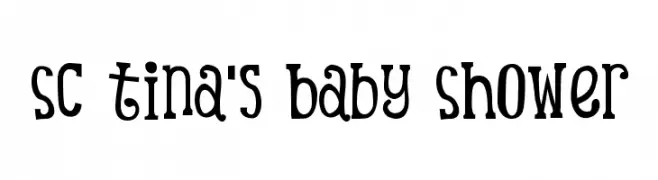
A playful and whimsical font with bold, slender strokes and decorative elements.
![SC Tina's Baby Shower フリーフォントのダウンロード]() ダウンロード 5168 ダウンロード数@WebFont
ダウンロード 5168 ダウンロード数@WebFont -
( Fonts by Dondon Nillo )
A bold, modern font with clean lines and strong presence.
![Dancing Juice & Salabat フリーフォントのダウンロード]() ダウンロード 5164 ダウンロード数@WebFont
ダウンロード 5164 ダウンロード数@WebFont -
( Fonts by ShyFonts )
A bold, futuristic font with geometric shapes and sharp angles.
![SF TransRobotics フリーフォントのダウンロード]() ダウンロード 5164 ダウンロード数@WebFont
ダウンロード 5164 ダウンロード数@WebFont -
( Copyright (c) 2010, Omnibus-Type (www.omnibus-type.com|omnibus.type@gmail.com) )
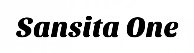
A bold, dynamic font with a slight slant and smooth curves.
![Sansita One フリーフォントのダウンロード]() ダウンロード 5163 ダウンロード数@WebFont
ダウンロード 5163 ダウンロード数@WebFont -
-
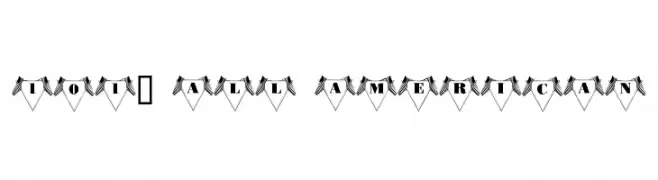
![101! All American フリーフォントのダウンロード]() ダウンロード 5159 ダウンロード数@WebFont
ダウンロード 5159 ダウンロード数@WebFont -
![Benjamin Gothic フリーフォントのダウンロード]() ダウンロード 5158 ダウンロード数
ダウンロード 5158 ダウンロード数 -
( Fonts by herofonts.com. Personal-use only. For commercial use please contact owner. )
A bold, geometric font with high contrast and tight spacing.
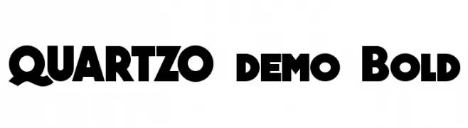
![QUARTZO demo Bold フリーフォントのダウンロード]() ダウンロード 5154 ダウンロード数@WebFont
ダウンロード 5154 ダウンロード数@WebFont -
( Fonts by Alphabet & Type: Typography & Graphic - Paolo Vannucci - www.alphabetype.it )
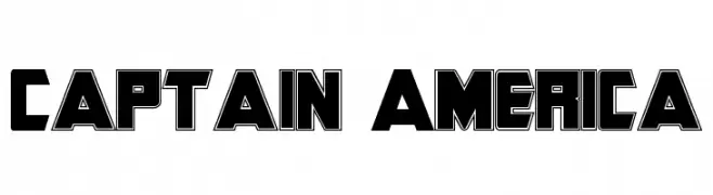
A bold, geometric font with strong, angular lines and a superhero aesthetic.
![Captain America フリーフォントのダウンロード]() ダウンロード 5154 ダウンロード数@WebFont
ダウンロード 5154 ダウンロード数@WebFont -
![Geo Bold フリーフォントのダウンロード]() ダウンロード 5153 ダウンロード数@WebFont
ダウンロード 5153 ダウンロード数@WebFont


今のトップフォントは?
は、クリーンな造形と広い適用範囲で支持を集めています。 ブランディングからランディングページ、ポスターまで活躍します。
ロゴで人気のフォントは?
幾何学系の サンセリフ(例: Poppins、Gotham 系のファミリー)は、スケーラブルでクリーンな印象に最適。 親しみやすさを出すなら スクリプト や手書き系も定番です。 見出しは力強く、本文はニュートラルに──この組み合わせが認知とバランスを高めます。
人気リストはどのくらいの頻度で更新される?
ダウンロード数やエンゲージメントに基づき定期的に更新します。 こまめにチェックして、次に流行るフォントを先取りしましょう。
💡 ヒント: このページをブックマークしておくと便利です。トレンドは速く、今のトップが明日のリブランディングを導くこともあります。