人気フォント セクションへようこそ。ここでは「よくダウンロードされ、よく使われている」実績ある書体をまとめています。 ロゴ、Web、SNS のどれにも使いやすい、外さない選択肢が見つかります。
どの トップフォント も、バランス・可読性・汎用性で高評価です。 モダン・サンセリフ、エレガントなスクリプト、ヴィンテージなセリフ、ミニマルなディスプレイなどを厳選しています。
-
 ダウンロード 435 ダウンロード数@WebFont
 -
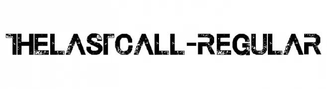
![TheLastCall-Regular フリーフォントのダウンロード]() ダウンロード 435 ダウンロード数@WebFont
ダウンロード 435 ダウンロード数@WebFont -
( Fonts by a Bigelow&Holmes . Personal-use only. For commercial use please contact owner. )
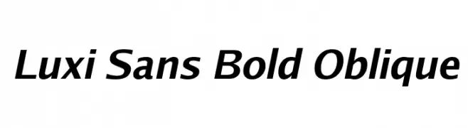
A bold, oblique sans-serif font with a modern and dynamic style.
![Luxi Sans Bold Oblique フリーフォントのダウンロード]() ダウンロード 435 ダウンロード数@WebFont
ダウンロード 435 ダウンロード数@WebFont -
( Fonts by Mike Abbink, Paul van der Laan, Pieter van Rosmalen - Personal-use only. For commercial use please contact owner. )
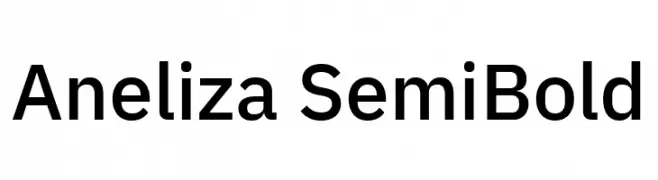
A clean, modern semi-bold typeface with excellent readability.
![Aneliza SemiBold フリーフォントのダウンロード]() ダウンロード 435 ダウンロード数@WebFont
ダウンロード 435 ダウンロード数@WebFont -
( Fonts by Khurasan )
A playful, bold font with rounded edges and a unique shadow effect.
![Sleepy Book フリーフォントのダウンロード]() ダウンロード 435 ダウンロード数@WebFont
ダウンロード 435 ダウンロード数@WebFont -
-
( Fonts by Tokopress )
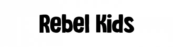
A bold, playful font with a hand-drawn, irregular style.
![Rebel Kids フリーフォントのダウンロード]() ダウンロード 434 ダウンロード数@WebFont
ダウンロード 434 ダウンロード数@WebFont -
( Fonts by Wino S Kadir - weknow - www.revolge.com/shop/weknow/ - Personal-use only. For commercial use please contact owner. )
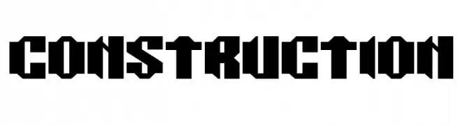
A bold, geometric font with angular lines and a modern, industrial feel.
![CONSTRUCTION フリーフォントのダウンロード]() ダウンロード 434 ダウンロード数@WebFont
ダウンロード 434 ダウンロード数@WebFont -
( Fonts by www.dcoxy.com )
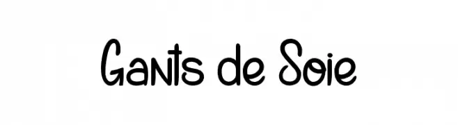
A playful, hand-drawn font with rounded, flowing characters.
![Gants de Soie フリーフォントのダウンロード]() ダウンロード 434 ダウンロード数@WebFont
ダウンロード 434 ダウンロード数@WebFont -
( Fonts by Dagon Collective )
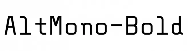
A bold, monospaced font with geometric lines and uniform character width.
![AltMono-Bold フリーフォントのダウンロード]() ダウンロード 434 ダウンロード数@WebFont
ダウンロード 434 ダウンロード数@WebFont -
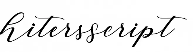
![HitersScript フリーフォントのダウンロード]() ダウンロード 434 ダウンロード数@WebFont
ダウンロード 434 ダウンロード数@WebFont

今のトップフォントは?
は、クリーンな造形と広い適用範囲で支持を集めています。 ブランディングからランディングページ、ポスターまで活躍します。
ロゴで人気のフォントは?
幾何学系の サンセリフ(例: Poppins、Gotham 系のファミリー)は、スケーラブルでクリーンな印象に最適。 親しみやすさを出すなら スクリプト や手書き系も定番です。 見出しは力強く、本文はニュートラルに──この組み合わせが認知とバランスを高めます。
人気リストはどのくらいの頻度で更新される?
ダウンロード数やエンゲージメントに基づき定期的に更新します。 こまめにチェックして、次に流行るフォントを先取りしましょう。
💡 ヒント: このページをブックマークしておくと便利です。トレンドは速く、今のトップが明日のリブランディングを導くこともあります。