人気フォント セクションへようこそ。ここでは「よくダウンロードされ、よく使われている」実績ある書体をまとめています。 ロゴ、Web、SNS のどれにも使いやすい、外さない選択肢が見つかります。
どの トップフォント も、バランス・可読性・汎用性で高評価です。 モダン・サンセリフ、エレガントなスクリプト、ヴィンテージなセリフ、ミニマルなディスプレイなどを厳選しています。
-
( Fonts by www.dcoxy.com )
A playful, hand-drawn font with rounded, flowing characters.
 ダウンロード 434 ダウンロード数@WebFont
 -
( Fonts by Dagon Collective )
A bold, monospaced font with geometric lines and uniform character width.
![AltMono-Bold フリーフォントのダウンロード]() ダウンロード 434 ダウンロード数@WebFont
ダウンロード 434 ダウンロード数@WebFont -
![HitersScript フリーフォントのダウンロード]() ダウンロード 434 ダウンロード数@WebFont
ダウンロード 434 ダウンロード数@WebFont -
( Fonts by Zetafonts )
A bold, slightly condensed modern font with geometric influences.
![Salad Interlock Trial Regular フリーフォントのダウンロード]() ダウンロード 434 ダウンロード数@WebFont
ダウンロード 434 ダウンロード数@WebFont -
( Fonts by Dieter Steffmann )
A bold, decorative font with artistic and dynamic character designs.
![Siegfried フリーフォントのダウンロード]() ダウンロード 434 ダウンロード数@WebFont
ダウンロード 434 ダウンロード数@WebFont -
-
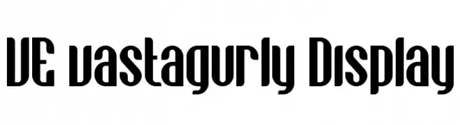
( Vast - Vast aka M Fairuzulhaq - creativemarket.com/vast )
A bold, modern font with tall, narrow characters and unique curvature.
![VE vastagurly Display フリーフォントのダウンロード]() ダウンロード 434 ダウンロード数@WebFont
ダウンロード 434 ダウンロード数@WebFont -
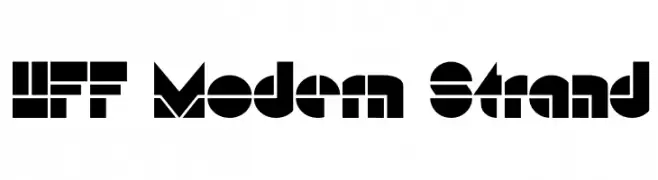
( Fonts by Have Fun with Fonts )
A bold, geometric font with a modern and impactful design.
![HFF Modern Strand フリーフォントのダウンロード]() ダウンロード 434 ダウンロード数@WebFont
ダウンロード 434 ダウンロード数@WebFont -
( Fonts by James Kilfiger - Personal-use only. For commercial use please contact owner. )
A modern, rounded font with uniform stroke width and excellent readability.
![Let's Trace basic フリーフォントのダウンロード]() ダウンロード 434 ダウンロード数@WebFont
ダウンロード 434 ダウンロード数@WebFont -
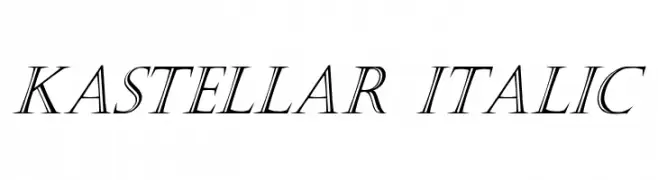
![Kastellar Italic フリーフォントのダウンロード]() ダウンロード 434 ダウンロード数@WebFont
ダウンロード 434 ダウンロード数@WebFont -
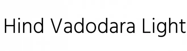
( Copyright (c) 2015 Indian Type Foundry (info@indiantypefoundry.com) )
A clean and modern sans-serif font with uniform stroke width and excellent readability.
![Hind Vadodara Light フリーフォントのダウンロード]() ダウンロード 434 ダウンロード数@WebFont
ダウンロード 434 ダウンロード数@WebFont


今のトップフォントは?
は、クリーンな造形と広い適用範囲で支持を集めています。 ブランディングからランディングページ、ポスターまで活躍します。
ロゴで人気のフォントは?
幾何学系の サンセリフ(例: Poppins、Gotham 系のファミリー)は、スケーラブルでクリーンな印象に最適。 親しみやすさを出すなら スクリプト や手書き系も定番です。 見出しは力強く、本文はニュートラルに──この組み合わせが認知とバランスを高めます。
人気リストはどのくらいの頻度で更新される?
ダウンロード数やエンゲージメントに基づき定期的に更新します。 こまめにチェックして、次に流行るフォントを先取りしましょう。
💡 ヒント: このページをブックマークしておくと便利です。トレンドは速く、今のトップが明日のリブランディングを導くこともあります。