人気フォント セクションへようこそ。ここでは「よくダウンロードされ、よく使われている」実績ある書体をまとめています。 ロゴ、Web、SNS のどれにも使いやすい、外さない選択肢が見つかります。
どの トップフォント も、バランス・可読性・汎用性で高評価です。 モダン・サンセリフ、エレガントなスクリプト、ヴィンテージなセリフ、ミニマルなディスプレイなどを厳選しています。
-
 ダウンロード 4988 ダウンロード数@WebFont
 -
( Fonts by a Viktor Hammarberg - www.viktorh.com. Personal-use only. For commercial use please contact owner. )
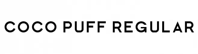
A bold, geometric sans-serif font with a modern and clean aesthetic.
![Coco Puff Regular フリーフォントのダウンロード]() ダウンロード 4988 ダウンロード数@WebFont
ダウンロード 4988 ダウンロード数@WebFont -
![Venus Rising フリーフォントのダウンロード]() ダウンロード 4985 ダウンロード数@WebFont
ダウンロード 4985 ダウンロード数@WebFont -
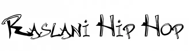
![Raslani Hip Hop フリーフォントのダウンロード]() ダウンロード 4984 ダウンロード数@WebFont
ダウンロード 4984 ダウンロード数@WebFont -
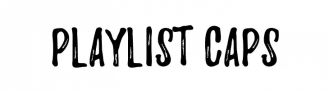
![Playlist-Caps フリーフォントのダウンロード]() ダウンロード 4982 ダウンロード数@WebFont
ダウンロード 4982 ダウンロード数@WebFont -
-
( Fonts by Alex Slobzheninov - Personal-use only. For commercial use please contact owner. )
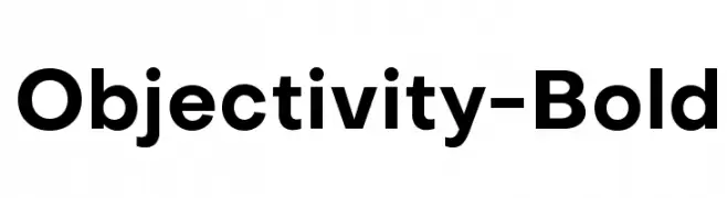
A bold, modern sans-serif font with clean lines and strong presence.
![Objectivity-Bold フリーフォントのダウンロード]() ダウンロード 4980 ダウンロード数@WebFont
ダウンロード 4980 ダウンロード数@WebFont -
( Fonts by Boba Fonts )
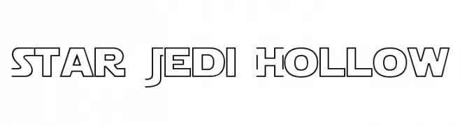
A futuristic, geometric font with hollow, outlined letterforms.
![Star Jedi Hollow フリーフォントのダウンロード]() ダウンロード 4980 ダウンロード数@WebFont
ダウンロード 4980 ダウンロード数@WebFont -
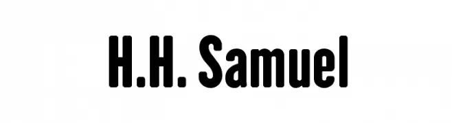
フォント by defharo. For commercial use please contact the owner.
![H.H. Samuel フリーフォントのダウンロード]() ダウンロード 4979 ダウンロード数@WebFont
ダウンロード 4979 ダウンロード数@WebFont -
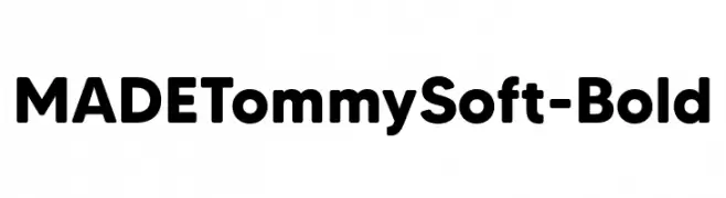
( Fonts by MadeType - Personal-use only. For commercial use please contact owner. )
A bold, rounded sans-serif font with smooth curves and a modern, friendly style.
![MADETommySoft-Bold フリーフォントのダウンロード]() ダウンロード 4976 ダウンロード数@WebFont
ダウンロード 4976 ダウンロード数@WebFont -
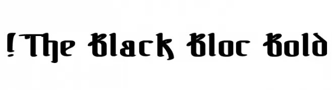
( Fonts by www.exclamachine.com )
A bold blackletter font with dramatic, angular strokes and intricate details.
![!The Black Bloc Bold フリーフォントのダウンロード]() ダウンロード 4976 ダウンロード数@WebFont
ダウンロード 4976 ダウンロード数@WebFont

今のトップフォントは?
は、クリーンな造形と広い適用範囲で支持を集めています。 ブランディングからランディングページ、ポスターまで活躍します。
ロゴで人気のフォントは?
幾何学系の サンセリフ(例: Poppins、Gotham 系のファミリー)は、スケーラブルでクリーンな印象に最適。 親しみやすさを出すなら スクリプト や手書き系も定番です。 見出しは力強く、本文はニュートラルに──この組み合わせが認知とバランスを高めます。
人気リストはどのくらいの頻度で更新される?
ダウンロード数やエンゲージメントに基づき定期的に更新します。 こまめにチェックして、次に流行るフォントを先取りしましょう。
💡 ヒント: このページをブックマークしておくと便利です。トレンドは速く、今のトップが明日のリブランディングを導くこともあります。