人気フォント セクションへようこそ。ここでは「よくダウンロードされ、よく使われている」実績ある書体をまとめています。 ロゴ、Web、SNS のどれにも使いやすい、外さない選択肢が見つかります。
どの トップフォント も、バランス・可読性・汎用性で高評価です。 モダン・サンセリフ、エレガントなスクリプト、ヴィンテージなセリフ、ミニマルなディスプレイなどを厳選しています。
-
 ダウンロード 5037 ダウンロード数@WebFont
 -
( Copyright 2018 The Mali Project Authors (https://github.com/cadsondemak/Mali) )
A bold, rounded, and playful font with a friendly and approachable style.
![Mali Bold フリーフォントのダウンロード]() ダウンロード 5033 ダウンロード数@WebFont
ダウンロード 5033 ダウンロード数@WebFont -
![TLC3D NHP2 フリーフォントのダウンロード]() ダウンロード 5033 ダウンロード数@WebFont
ダウンロード 5033 ダウンロード数@WebFont -
( Fonts by junkohanhero )
A bold, distressed font with a vintage, grunge aesthetic.
![Sun zoom spark フリーフォントのダウンロード]() ダウンロード 5033 ダウンロード数@WebFont
ダウンロード 5033 ダウンロード数@WebFont -
( Copyright (c) 2009, Matt McInerney (matt@pixelspread.com) )
A futuristic, geometric font with clean lines and a modern aesthetic.
![Orbitron Regular フリーフォントのダウンロード]() ダウンロード 5030 ダウンロード数@WebFont
ダウンロード 5030 ダウンロード数@WebFont -
-
( Fonts by Arkandis Digital Foundry )
A bold, serif font with strong, authoritative strokes and classic design.
![VenturisADFHeavy フリーフォントのダウンロード]() ダウンロード 5030 ダウンロード数@WebFont
ダウンロード 5030 ダウンロード数@WebFont -
![TOMMY HILFIGER AF フリーフォントのダウンロード]() ダウンロード 5028 ダウンロード数@WebFont
ダウンロード 5028 ダウンロード数@WebFont -
( Yellow Design Studio - Ryan Martinson - www.yellowdesignstudio.com )
A bold, elegant script font with dramatic flourishes and high contrast.
![Thirsty Script Extrabold Demo フリーフォントのダウンロード]() ダウンロード 5027 ダウンロード数@WebFont
ダウンロード 5027 ダウンロード数@WebFont -
( Fonts by www.tipometar.org )
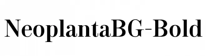
A bold, classic serif font with high contrast and pronounced serifs.
![NeoplantaBG-Bold フリーフォントのダウンロード]() ダウンロード 5027 ダウンロード数@WebFont
ダウンロード 5027 ダウンロード数@WebFont -
( Free )
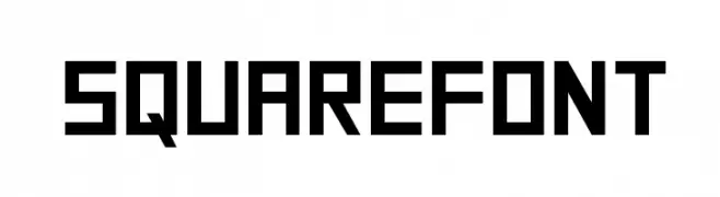
A bold, geometric font with a modern, monospaced appearance.
![SquareFont フリーフォントのダウンロード]() ダウンロード 5026 ダウンロード数@WebFont
ダウンロード 5026 ダウンロード数@WebFont


今のトップフォントは?
は、クリーンな造形と広い適用範囲で支持を集めています。 ブランディングからランディングページ、ポスターまで活躍します。
ロゴで人気のフォントは?
幾何学系の サンセリフ(例: Poppins、Gotham 系のファミリー)は、スケーラブルでクリーンな印象に最適。 親しみやすさを出すなら スクリプト や手書き系も定番です。 見出しは力強く、本文はニュートラルに──この組み合わせが認知とバランスを高めます。
人気リストはどのくらいの頻度で更新される?
ダウンロード数やエンゲージメントに基づき定期的に更新します。 こまめにチェックして、次に流行るフォントを先取りしましょう。
💡 ヒント: このページをブックマークしておくと便利です。トレンドは速く、今のトップが明日のリブランディングを導くこともあります。