人気フォント セクションへようこそ。ここでは「よくダウンロードされ、よく使われている」実績ある書体をまとめています。 ロゴ、Web、SNS のどれにも使いやすい、外さない選択肢が見つかります。
どの トップフォント も、バランス・可読性・汎用性で高評価です。 モダン・サンセリフ、エレガントなスクリプト、ヴィンテージなセリフ、ミニマルなディスプレイなどを厳選しています。
-
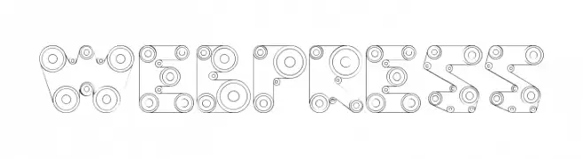
( Fonts by Daniel Gauthier )
A decorative, mechanical-themed font with intricate circular and linear patterns.
 ダウンロード 340 ダウンロード数@WebFont
 -
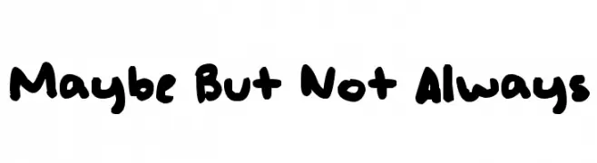
( - so-close-to-dying.tumblr.com )
A bold, playful handwritten font with a casual and friendly style.
![Maybe But Not Always フリーフォントのダウンロード]() ダウンロード 340 ダウンロード数@WebFont
ダウンロード 340 ダウンロード数@WebFont -
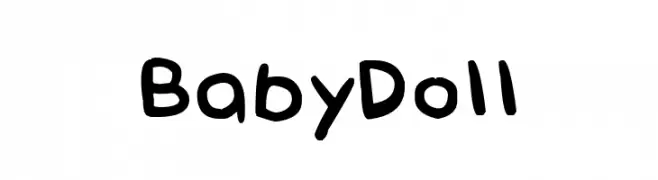
( Fonts by Denne - Denise Bentulan - Personal-use only. For commercial use please contact owner. )
A playful, hand-drawn font with rounded, uneven strokes.
![Baby Doll フリーフォントのダウンロード]() ダウンロード 340 ダウンロード数@WebFont
ダウンロード 340 ダウンロード数@WebFont -
![Autos フリーフォントのダウンロード]() ダウンロード 340 ダウンロード数@WebFont
ダウンロード 340 ダウンロード数@WebFont -
( Fonts by Graham Meade - GemFonts )
A bold, textured font with a distressed, handcrafted appearance.
![Heavy Texture フリーフォントのダウンロード]() ダウンロード 340 ダウンロード数@WebFont
ダウンロード 340 ダウンロード数@WebFont -
-
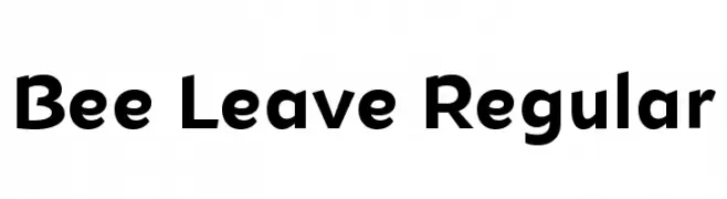
( Fonts by Misti Hammers - mistifonts.com - Personal-use only. For commercial use please contact owner. )
A bold, modern sans-serif font with clean lines and geometric shapes.
![Bee Leave Regular フリーフォントのダウンロード]() ダウンロード 340 ダウンロード数@WebFont
ダウンロード 340 ダウンロード数@WebFont -
( Fonts by GFR Creative )
A bold, playful script font with a hand-drawn, energetic style.
![Smile Candy フリーフォントのダウンロード]() ダウンロード 340 ダウンロード数@WebFont
ダウンロード 340 ダウンロード数@WebFont -
( ingoFonts - Ingo Zimmermann - www.ingofonts.com )
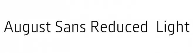
A modern, light sans-serif font with clean lines and balanced proportions.
![August Sans Reduced 45 Light フリーフォントのダウンロード]() ダウンロード 340 ダウンロード数@WebFont
ダウンロード 340 ダウンロード数@WebFont -
( Fonts by Apostrophic Lab )
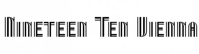
A geometric, Art Deco-inspired font with a strong vertical emphasis.
![Nineteen Ten Vienna フリーフォントのダウンロード]() ダウンロード 340 ダウンロード数@WebFont
ダウンロード 340 ダウンロード数@WebFont -
( Fonts by Daniel Gauthier )
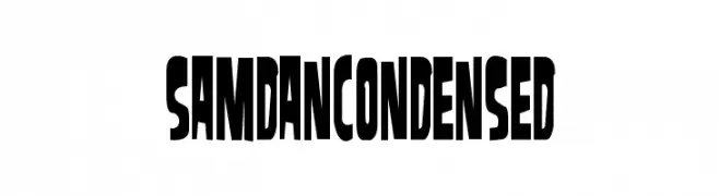
A bold, condensed font with a modern and striking appearance.
![SamdanCondensed フリーフォントのダウンロード]() ダウンロード 340 ダウンロード数@WebFont
ダウンロード 340 ダウンロード数@WebFont


今のトップフォントは?
は、クリーンな造形と広い適用範囲で支持を集めています。 ブランディングからランディングページ、ポスターまで活躍します。
ロゴで人気のフォントは?
幾何学系の サンセリフ(例: Poppins、Gotham 系のファミリー)は、スケーラブルでクリーンな印象に最適。 親しみやすさを出すなら スクリプト や手書き系も定番です。 見出しは力強く、本文はニュートラルに──この組み合わせが認知とバランスを高めます。
人気リストはどのくらいの頻度で更新される?
ダウンロード数やエンゲージメントに基づき定期的に更新します。 こまめにチェックして、次に流行るフォントを先取りしましょう。
💡 ヒント: このページをブックマークしておくと便利です。トレンドは速く、今のトップが明日のリブランディングを導くこともあります。