人気フォント セクションへようこそ。ここでは「よくダウンロードされ、よく使われている」実績ある書体をまとめています。 ロゴ、Web、SNS のどれにも使いやすい、外さない選択肢が見つかります。
どの トップフォント も、バランス・可読性・汎用性で高評価です。 モダン・サンセリフ、エレガントなスクリプト、ヴィンテージなセリフ、ミニマルなディスプレイなどを厳選しています。
-
( Copyright 2018 Boutros International. (http://www.boutrosfonts.com) )
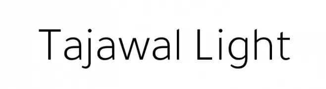
A modern, light sans-serif font with low contrast and excellent readability.
 ダウンロード 340 ダウンロード数@WebFont
 -
( Fonts by Manfred Klein. Free for private and charity use. Free for commercial with donation to organizations )
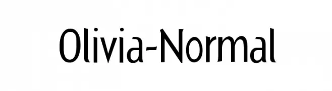
A modern sans-serif font with a clean and balanced design.
![Olivia-Normal フリーフォントのダウンロード]() ダウンロード 340 ダウンロード数@WebFont
ダウンロード 340 ダウンロード数@WebFont -
( Fonts by or from www.graffitifonts.net )
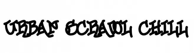
A bold, graffiti-inspired font with dynamic, flowing lines and a playful, urban aesthetic.
![Urban Scrawl Chill フリーフォントのダウンロード]() ダウンロード 340 ダウンロード数
ダウンロード 340 ダウンロード数 -
( Fonts by IBM )
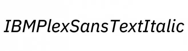
A modern, italic sans-serif font with clean lines and balanced proportions.
![IBM Plex Sans Text Italic フリーフォントのダウンロード]() ダウンロード 340 ダウンロード数@WebFont
ダウンロード 340 ダウンロード数@WebFont -
( Fonts by www.gliphmaker.com. Personal-use only. For commercial use please contact owner. )
A bold, geometric font with a modern, decorative style featuring layered lines.
![Stereovolna フリーフォントのダウンロード]() ダウンロード 340 ダウンロード数@WebFont
ダウンロード 340 ダウンロード数@WebFont -
-
( Fonts by Polah Type )
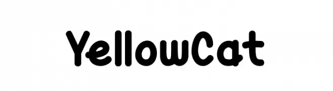
A playful, rounded typeface with bold, smooth curves and a friendly appearance.
![Yellow Cat フリーフォントのダウンロード]() ダウンロード 340 ダウンロード数@WebFont
ダウンロード 340 ダウンロード数@WebFont -
( Fonts by www.kimberlygeswein.com - Kimberly Geswein )
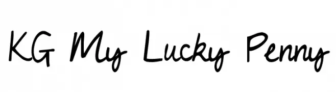
A playful, casual handwritten font with smooth, flowing curves.
![KG My Lucky Penny フリーフォントのダウンロード]() ダウンロード 340 ダウンロード数@WebFont
ダウンロード 340 ダウンロード数@WebFont -
( Fonts by Jen Jones )
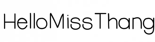
A playful, modern font with rounded edges and a clean aesthetic.
![HelloMissThang フリーフォントのダウンロード]() ダウンロード 340 ダウンロード数@WebFont
ダウンロード 340 ダウンロード数@WebFont -
![Marquis De Sade フリーフォントのダウンロード]() ダウンロード 340 ダウンロード数@WebFont
ダウンロード 340 ダウンロード数@WebFont -
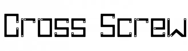
![Cross Screw フリーフォントのダウンロード]() ダウンロード 340 ダウンロード数@WebFont
ダウンロード 340 ダウンロード数@WebFont


今のトップフォントは?
は、クリーンな造形と広い適用範囲で支持を集めています。 ブランディングからランディングページ、ポスターまで活躍します。
ロゴで人気のフォントは?
幾何学系の サンセリフ(例: Poppins、Gotham 系のファミリー)は、スケーラブルでクリーンな印象に最適。 親しみやすさを出すなら スクリプト や手書き系も定番です。 見出しは力強く、本文はニュートラルに──この組み合わせが認知とバランスを高めます。
人気リストはどのくらいの頻度で更新される?
ダウンロード数やエンゲージメントに基づき定期的に更新します。 こまめにチェックして、次に流行るフォントを先取りしましょう。
💡 ヒント: このページをブックマークしておくと便利です。トレンドは速く、今のトップが明日のリブランディングを導くこともあります。