人気フォント セクションへようこそ。ここでは「よくダウンロードされ、よく使われている」実績ある書体をまとめています。 ロゴ、Web、SNS のどれにも使いやすい、外さない選択肢が見つかります。
どの トップフォント も、バランス・可読性・汎用性で高評価です。 モダン・サンセリフ、エレガントなスクリプト、ヴィンテージなセリフ、ミニマルなディスプレイなどを厳選しています。
-
 ダウンロード 1215 ダウンロード数@WebFont
 -
![MuRdOiNk MKDA フリーフォントのダウンロード]() ダウンロード 1215 ダウンロード数@WebFont
ダウンロード 1215 ダウンロード数@WebFont -
( Fonts by CGF Chris Garrett Fonts - Chris Garrett )
A bold, geometric font with an architectural influence, perfect for impactful designs.
![CGF Arch Reactor フリーフォントのダウンロード]() ダウンロード 1215 ダウンロード数@WebFont
ダウンロード 1215 ダウンロード数@WebFont -
( Fonts by Jacob Fisher - www.pizzadude.dk )
A modern, geometric font with clean lines and rounded edges.
![MammaGamma フリーフォントのダウンロード]() ダウンロード 1215 ダウンロード数@WebFont
ダウンロード 1215 ダウンロード数@WebFont -
( Fonts by Jacob Fisher - www.pizzadude.dk )
A bold, distressed font with a hand-painted, artistic style.
![Asqualt フリーフォントのダウンロード]() ダウンロード 1215 ダウンロード数@WebFont
ダウンロード 1215 ダウンロード数@WebFont -
![Shattered フリーフォントのダウンロード]() ダウンロード 1215 ダウンロード数@WebFont
ダウンロード 1215 ダウンロード数@WebFont -
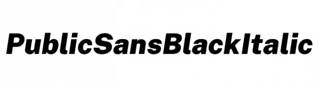
( Fonts by U.S. Web Design System )
A bold, italicized font with a modern and assertive style.
![Public Sans Black Italic フリーフォントのダウンロード]() ダウンロード 1214 ダウンロード数@WebFont
ダウンロード 1214 ダウンロード数@WebFont -
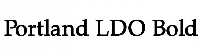
( Fonts by Luke Owens - Personal-use only. For commercial use please contact owner. )
A bold, classic serif font with strong, authoritative characters.
![Portland LDO Bold フリーフォントのダウンロード]() ダウンロード 1214 ダウンロード数@WebFont
ダウンロード 1214 ダウンロード数@WebFont -
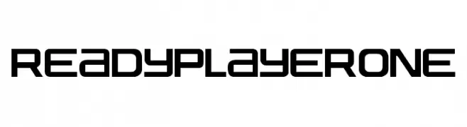
( Fonts by Fran Fernandez - Personal-use only. For commercial use please contact owner. )
A futuristic, geometric font with bold, angular letterforms and a tech-inspired aesthetic.
![Ready Player One フリーフォントのダウンロード]() ダウンロード 1214 ダウンロード数@WebFont
ダウンロード 1214 ダウンロード数@WebFont -
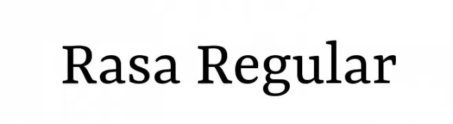
( Copyright (c) 2015 by Rosetta Type Foundry s.r.o. (info@rosettatype.com). )
A modern serif font with balanced proportions and clear readability.
![Rasa Regular フリーフォントのダウンロード]() ダウンロード 1214 ダウンロード数@WebFont
ダウンロード 1214 ダウンロード数@WebFont -
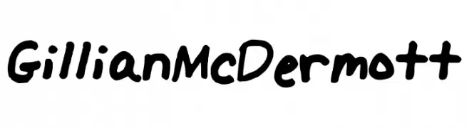
フォント by GillianMcDermott. For commercial use please contact the owner.
![GillianMcDermott フリーフォントのダウンロード]() ダウンロード 1214 ダウンロード数@WebFont
ダウンロード 1214 ダウンロード数@WebFont -
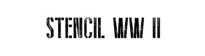
( Fonts by a Galdino Otten - galdinootten.com . Personal-use only. For commercial use please contact owner. )
A bold, distressed stencil font with a vintage military aesthetic.
![Stencil WW II フリーフォントのダウンロード]() ダウンロード 1214 ダウンロード数@WebFont
ダウンロード 1214 ダウンロード数@WebFont -
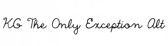
( Fonts by www.kimberlygeswein.com - Kimberly Geswein )
A playful and whimsical script font with fluid, connected letterforms.
![KG The Only Exception Alt フリーフォントのダウンロード]() ダウンロード 1214 ダウンロード数@WebFont
ダウンロード 1214 ダウンロード数@WebFont -
![IwonaCondHeavy-Regular フリーフォントのダウンロード]() ダウンロード 1214 ダウンロード数@WebFont
ダウンロード 1214 ダウンロード数@WebFont -
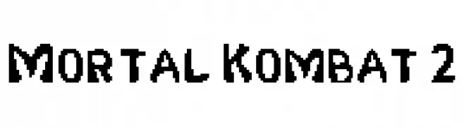
![Mortal Kombat 2 フリーフォントのダウンロード]() ダウンロード 1214 ダウンロード数@WebFont
ダウンロード 1214 ダウンロード数@WebFont -
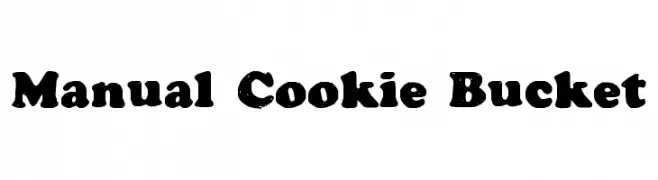
![Manual Cookie Bucket フリーフォントのダウンロード]() ダウンロード 1214 ダウンロード数@WebFont
ダウンロード 1214 ダウンロード数@WebFont -
( Fonts by www.paintblackeditions.org )
A bold, distressed font with a grunge effect for impactful designs.
![BurnOut フリーフォントのダウンロード]() ダウンロード 1214 ダウンロード数@WebFont
ダウンロード 1214 ダウンロード数@WebFont -
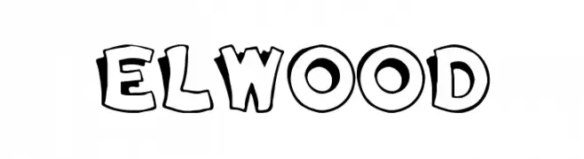
![Elwood フリーフォントのダウンロード]() ダウンロード 1214 ダウンロード数
ダウンロード 1214 ダウンロード数 -
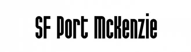
( Fonts by ShyFonts )
A bold, condensed font with a modern yet slightly vintage style.
![SF Port McKenzie フリーフォントのダウンロード]() ダウンロード 1214 ダウンロード数@WebFont
ダウンロード 1214 ダウンロード数@WebFont -
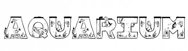
![Aquarium フリーフォントのダウンロード]() ダウンロード 1214 ダウンロード数@WebFont
ダウンロード 1214 ダウンロード数@WebFont -
( Fonts by deFharo - Fernando Haro - Personal-use only. For commercial use please contact owner. )
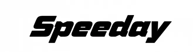
A bold, italicized font with angular lines and a dynamic, modern style.
![Speeday フリーフォントのダウンロード]() ダウンロード 1213 ダウンロード数@WebFont
ダウンロード 1213 ダウンロード数@WebFont -
( Fonts by Font People - Personal-use only. For commercial use please contact owner. )
A modern, semi-bold sans-serif font with excellent readability and versatility.
![Mazin DEMO SemiBold フリーフォントのダウンロード]() ダウンロード 1213 ダウンロード数@WebFont
ダウンロード 1213 ダウンロード数@WebFont -
( Fonts by Sharkshock - Personal-use only. For commercial use please contact owner. )
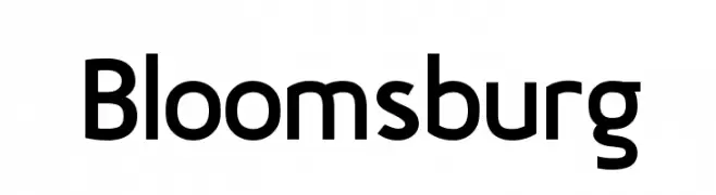
A modern, geometric sans-serif font with a clean and versatile design.
![Bloomsburg フリーフォントのダウンロード]() ダウンロード 1213 ダウンロード数@WebFont
ダウンロード 1213 ダウンロード数@WebFont -
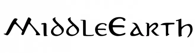
![MiddleEarth フリーフォントのダウンロード]() ダウンロード 1213 ダウンロード数@WebFont
ダウンロード 1213 ダウンロード数@WebFont -
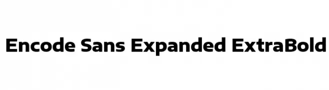
( Copyright 2012 The Encode Project Authors (impallari@gmail.com), with Reserved Font Name "Encode Sansâ€. )
A bold, expanded sans-serif font with a modern and impactful design.
![Encode Sans Expanded ExtraBold フリーフォントのダウンロード]() ダウンロード 1213 ダウンロード数@WebFont
ダウンロード 1213 ダウンロード数@WebFont -
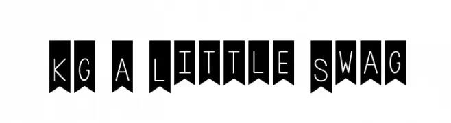
( Fonts by www.kimberlygeswein.com - Kimberly Geswein )
A playful, decorative font with a hand-drawn, whimsical style on banner backgrounds.
![KG A Little Swag フリーフォントのダウンロード]() ダウンロード 1213 ダウンロード数@WebFont
ダウンロード 1213 ダウンロード数@WebFont -
![NOKIA® 5110 FontSet フリーフォントのダウンロード]() ダウンロード 1213 ダウンロード数@WebFont
ダウンロード 1213 ダウンロード数@WebFont -
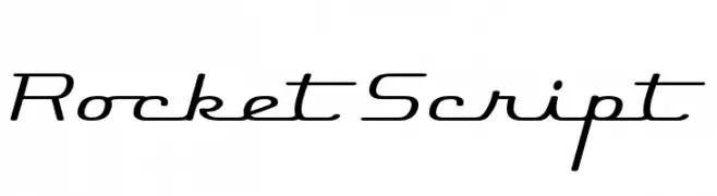
( Fonts by www.fontdiner.com )
A sleek, modern cursive font with smooth, flowing lines and slightly slanted characters.
![Rocket Script フリーフォントのダウンロード]() ダウンロード 1213 ダウンロード数@WebFont
ダウンロード 1213 ダウンロード数@WebFont -
![uni 05_53 フリーフォントのダウンロード]() ダウンロード 1213 ダウンロード数@WebFont
ダウンロード 1213 ダウンロード数@WebFont -
![101! Heart Catcher フリーフォントのダウンロード]() ダウンロード 1213 ダウンロード数@WebFont
ダウンロード 1213 ダウンロード数@WebFont -
![Cher Font フリーフォントのダウンロード]() ダウンロード 1213 ダウンロード数@WebFont
ダウンロード 1213 ダウンロード数@WebFont -
![Frontier フリーフォントのダウンロード]() ダウンロード 1213 ダウンロード数@WebFont
ダウンロード 1213 ダウンロード数@WebFont -
( Fonts by Hanoded )
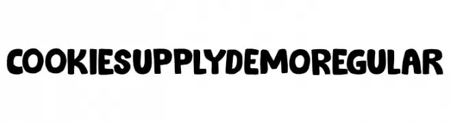
A bold, playful font with a chunky, hand-drawn style and textured details.
![Cookie Supply DEMO Regular フリーフォントのダウンロード]() ダウンロード 1212 ダウンロード数@WebFont
ダウンロード 1212 ダウンロード数@WebFont -
( imagex - www.imagex-fonts.com )
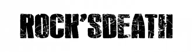
A bold, distressed font with a grunge aesthetic and rugged texture.
![Rock's Death フリーフォントのダウンロード]() ダウンロード 1212 ダウンロード数@WebFont
ダウンロード 1212 ダウンロード数@WebFont -
( Sabrtype - creativemarket.com/Sabrtype )
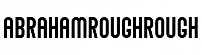
A bold, rough-textured font with a vintage, industrial style.
![Abraham Rough Rough フリーフォントのダウンロード]() ダウンロード 1212 ダウンロード数@WebFont
ダウンロード 1212 ダウンロード数@WebFont


今のトップフォントは?
は、クリーンな造形と広い適用範囲で支持を集めています。 ブランディングからランディングページ、ポスターまで活躍します。
ロゴで人気のフォントは?
幾何学系の サンセリフ(例: Poppins、Gotham 系のファミリー)は、スケーラブルでクリーンな印象に最適。 親しみやすさを出すなら スクリプト や手書き系も定番です。 見出しは力強く、本文はニュートラルに──この組み合わせが認知とバランスを高めます。
人気リストはどのくらいの頻度で更新される?
ダウンロード数やエンゲージメントに基づき定期的に更新します。 こまめにチェックして、次に流行るフォントを先取りしましょう。
💡 ヒント: このページをブックマークしておくと便利です。トレンドは速く、今のトップが明日のリブランディングを導くこともあります。