人気フォント セクションへようこそ。ここでは「よくダウンロードされ、よく使われている」実績ある書体をまとめています。 ロゴ、Web、SNS のどれにも使いやすい、外さない選択肢が見つかります。
どの トップフォント も、バランス・可読性・汎用性で高評価です。 モダン・サンセリフ、エレガントなスクリプト、ヴィンテージなセリフ、ミニマルなディスプレイなどを厳選しています。
-
( Fonts by www.neogrey.com - Neogrey Creative )
A modern, geometric font with clean lines and a technical feel.
 ダウンロード 4063 ダウンロード数@WebFont
 -
![Samarkan Oblique フリーフォントのダウンロード]() ダウンロード 4063 ダウンロード数
ダウンロード 4063 ダウンロード数 -
( Fonts by billyargel.blogspot.com - Billy Argel )
An ornate and artistic font with swirling flourishes and grunge effects.
![Ginga> フリーフォントのダウンロード]() ダウンロード 4061 ダウンロード数@WebFont
ダウンロード 4061 ダウンロード数@WebFont -
( Copyright (c) 2011, JM Sole (http://jmsole.cl|info@jmsole.cl) )
A bold, classic serif font with moderate contrast and formal style.
![Noticia Text Bold フリーフォントのダウンロード]() ダウンロード 4059 ダウンロード数@WebFont
ダウンロード 4059 ダウンロード数@WebFont -
![Lauren Normal フリーフォントのダウンロード]() ダウンロード 4058 ダウンロード数@WebFont
ダウンロード 4058 ダウンロード数@WebFont -
-
( Fonts by a Situjuh Nazara - c7n1.wordpress.com. Personal-use only. For commercial use please contact owner. )
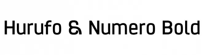
A bold, modern sans-serif font with a geometric and uniform design.
![Hurufo & Numero Bold フリーフォントのダウンロード]() ダウンロード 4057 ダウンロード数@WebFont
ダウンロード 4057 ダウンロード数@WebFont -
( Fonts by www.fonthead.com )
A playful, handwritten font with bold, rounded strokes and a whimsical style.
![GoodDog フリーフォントのダウンロード]() ダウンロード 4057 ダウンロード数@WebFont
ダウンロード 4057 ダウンロード数@WebFont -
( Fonts by Castcraft Software - opti.netii.net - check the website before use )
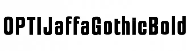
A bold, geometric font with strong, uniform strokes ideal for impactful headlines.
![OPTIJaffaGothicBold フリーフォントのダウンロード]() ダウンロード 4056 ダウンロード数@WebFont
ダウンロード 4056 ダウンロード数@WebFont -
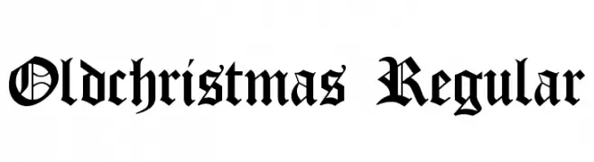
![Oldchristmas Regular フリーフォントのダウンロード]() ダウンロード 4056 ダウンロード数@WebFont
ダウンロード 4056 ダウンロード数@WebFont -
( Fonts by www.marcelomagalhaes.net )
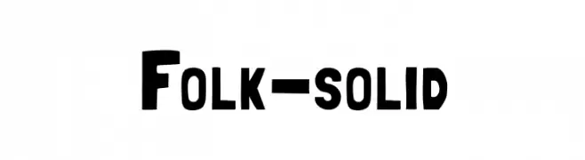
A bold, solid font with a vintage yet modern appeal, ideal for impactful designs.
![Folk-solid フリーフォントのダウンロード]() ダウンロード 4055 ダウンロード数@WebFont
ダウンロード 4055 ダウンロード数@WebFont


今のトップフォントは?
は、クリーンな造形と広い適用範囲で支持を集めています。 ブランディングからランディングページ、ポスターまで活躍します。
ロゴで人気のフォントは?
幾何学系の サンセリフ(例: Poppins、Gotham 系のファミリー)は、スケーラブルでクリーンな印象に最適。 親しみやすさを出すなら スクリプト や手書き系も定番です。 見出しは力強く、本文はニュートラルに──この組み合わせが認知とバランスを高めます。
人気リストはどのくらいの頻度で更新される?
ダウンロード数やエンゲージメントに基づき定期的に更新します。 こまめにチェックして、次に流行るフォントを先取りしましょう。
💡 ヒント: このページをブックマークしておくと便利です。トレンドは速く、今のトップが明日のリブランディングを導くこともあります。