人気フォント セクションへようこそ。ここでは「よくダウンロードされ、よく使われている」実績ある書体をまとめています。 ロゴ、Web、SNS のどれにも使いやすい、外さない選択肢が見つかります。
どの トップフォント も、バランス・可読性・汎用性で高評価です。 モダン・サンセリフ、エレガントなスクリプト、ヴィンテージなセリフ、ミニマルなディスプレイなどを厳選しています。
-
 ダウンロード 3792 ダウンロード数@WebFont
 -
( Fonts by Kotak Kuning Studio )
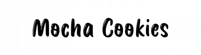
A bold, playful font with a hand-drawn, energetic style.
![Mocha Cookies フリーフォントのダウンロード]() ダウンロード 3791 ダウンロード数@WebFont
ダウンロード 3791 ダウンロード数@WebFont -
( Fonts by Castcraft Software - opti.netii.net - check the website before use )
A bold, narrow font with high contrast, perfect for impactful headlines.
![OPBinderStyle-Bold フリーフォントのダウンロード]() ダウンロード 3791 ダウンロード数@WebFont
ダウンロード 3791 ダウンロード数@WebFont -
![hebrew フリーフォントのダウンロード]() ダウンロード 3790 ダウンロード数
ダウンロード 3790 ダウンロード数 -
( Fonts by Alfredo Marco Pradil - Personal-use only. For commercial use please contact owner. )
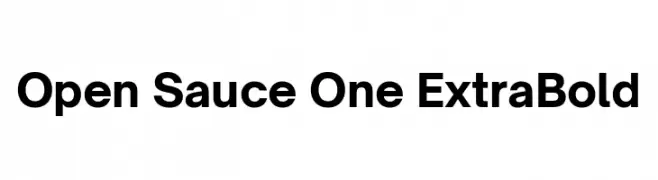
A bold, modern typeface with clean lines and strong geometric shapes.
![Open Sauce One ExtraBold フリーフォントのダウンロード]() ダウンロード 3789 ダウンロード数@WebFont
ダウンロード 3789 ダウンロード数@WebFont -
-
( Copyright (c) 2014, Indian Type Foundry (info@indiantypefoundry.com). )
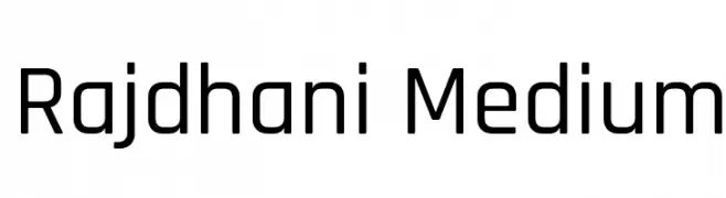
A geometric sans-serif font with a modern and clean design.
![Rajdhani Medium フリーフォントのダウンロード]() ダウンロード 3789 ダウンロード数@WebFont
ダウンロード 3789 ダウンロード数@WebFont -
( Fonts by HENRIavecunK. Personal-use only. For commercial use please contact owner. )
A bold, condensed font with a modern and sleek appearance.
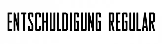
![Entschuldigung Regular フリーフォントのダウンロード]() ダウンロード 3788 ダウンロード数@WebFont
ダウンロード 3788 ダウンロード数@WebFont -
( Fonts by Sinister Visions - Chad Savage - www.sinisterfonts.com )
A jagged, gothic font with sharp, thorn-like characters.
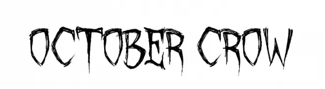
![October Crow フリーフォントのダウンロード]() ダウンロード 3788 ダウンロード数@WebFont
ダウンロード 3788 ダウンロード数@WebFont -
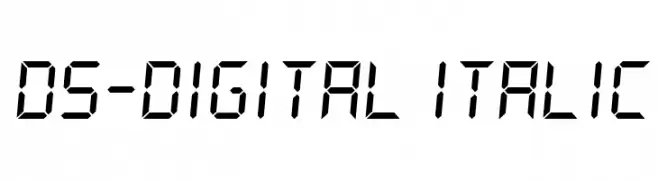
![DS-Digital Italic フリーフォントのダウンロード]() ダウンロード 3787 ダウンロード数@WebFont
ダウンロード 3787 ダウンロード数@WebFont -
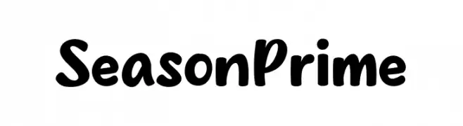
( Fonts by MJType )
A playful, bold font with rounded edges and a hand-drawn feel.
![Season Prime フリーフォントのダウンロード]() ダウンロード 3786 ダウンロード数@WebFont
ダウンロード 3786 ダウンロード数@WebFont


今のトップフォントは?
は、クリーンな造形と広い適用範囲で支持を集めています。 ブランディングからランディングページ、ポスターまで活躍します。
ロゴで人気のフォントは?
幾何学系の サンセリフ(例: Poppins、Gotham 系のファミリー)は、スケーラブルでクリーンな印象に最適。 親しみやすさを出すなら スクリプト や手書き系も定番です。 見出しは力強く、本文はニュートラルに──この組み合わせが認知とバランスを高めます。
人気リストはどのくらいの頻度で更新される?
ダウンロード数やエンゲージメントに基づき定期的に更新します。 こまめにチェックして、次に流行るフォントを先取りしましょう。
💡 ヒント: このページをブックマークしておくと便利です。トレンドは速く、今のトップが明日のリブランディングを導くこともあります。