人気フォント セクションへようこそ。ここでは「よくダウンロードされ、よく使われている」実績ある書体をまとめています。 ロゴ、Web、SNS のどれにも使いやすい、外さない選択肢が見つかります。
どの トップフォント も、バランス・可読性・汎用性で高評価です。 モダン・サンセリフ、エレガントなスクリプト、ヴィンテージなセリフ、ミニマルなディスプレイなどを厳選しています。
-
( Copyright (c) 2009, Mark Simonson (http://www.ms-studio.com, mark@marksimonson.com) )
A bold, monospaced font with a clean and modern design, ideal for technical applications.
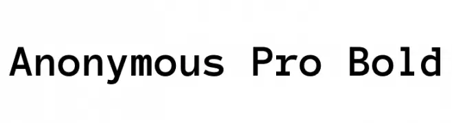 ダウンロード 3751 ダウンロード数@WebFont
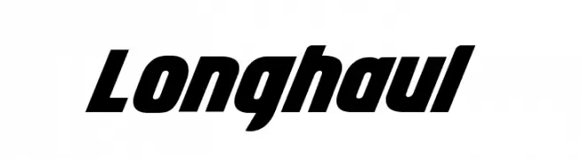
 -
![Longhaul フリーフォントのダウンロード]() ダウンロード 3750 ダウンロード数@WebFont
ダウンロード 3750 ダウンロード数@WebFont -
( Fonts by Lauren Thompson - www.nymfont.com )
A classic serif font with elegant curves and moderate contrast.
![Aver フリーフォントのダウンロード]() ダウンロード 3749 ダウンロード数@WebFont
ダウンロード 3749 ダウンロード数@WebFont -
( Fonts by Jecko Development - www.jeckodevelopment.com )
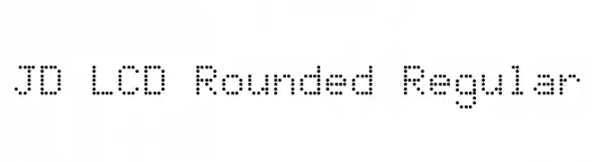
A dot matrix font with a modern, digital display aesthetic.
![JD LCD Rounded Regular フリーフォントのダウンロード]() ダウンロード 3749 ダウンロード数@WebFont
ダウンロード 3749 ダウンロード数@WebFont -
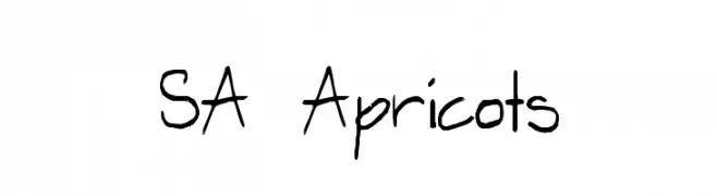
![SA Apricots フリーフォントのダウンロード]() ダウンロード 3749 ダウンロード数@WebFont
ダウンロード 3749 ダウンロード数@WebFont -
-
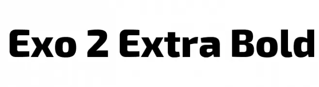
( Copyright (c) 2013, Natanael Gama (www.ndiscovered.com . info(at)ndiscovered.com), with Reserved Font Name 'Exo' )
A bold, modern font with a strong geometric structure and consistent stroke width.
![Exo 2 Extra Bold フリーフォントのダウンロード]() ダウンロード 3747 ダウンロード数@WebFont
ダウンロード 3747 ダウンロード数@WebFont -
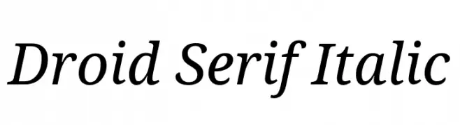
( Google Web Fonts )
An elegant serif font with a classic italic slant and medium contrast.
![Droid Serif Italic フリーフォントのダウンロード]() ダウンロード 3747 ダウンロード数@WebFont
ダウンロード 3747 ダウンロード数@WebFont -
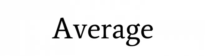
( Copyright (c) 2012, Eduardo Tunni (http://www.tipo.net.ar), with Reserved Font Name "Average" )
A classic serif font with elegant strokes and balanced proportions.
![Average フリーフォントのダウンロード]() ダウンロード 3746 ダウンロード数@WebFont
ダウンロード 3746 ダウンロード数@WebFont -
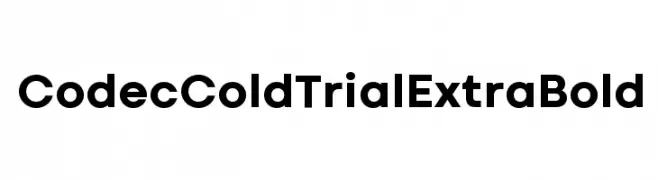
( Zetafonts - www.zetafonts.com )
A bold, modern sans-serif font with clean lines and geometric shapes.
![Codec Cold Trial ExtraBold フリーフォントのダウンロード]() ダウンロード 3745 ダウンロード数@WebFont
ダウンロード 3745 ダウンロード数@WebFont -
![Action Is JL フリーフォントのダウンロード]() ダウンロード 3745 ダウンロード数@WebFont
ダウンロード 3745 ダウンロード数@WebFont

今のトップフォントは?
は、クリーンな造形と広い適用範囲で支持を集めています。 ブランディングからランディングページ、ポスターまで活躍します。
ロゴで人気のフォントは?
幾何学系の サンセリフ(例: Poppins、Gotham 系のファミリー)は、スケーラブルでクリーンな印象に最適。 親しみやすさを出すなら スクリプト や手書き系も定番です。 見出しは力強く、本文はニュートラルに──この組み合わせが認知とバランスを高めます。
人気リストはどのくらいの頻度で更新される?
ダウンロード数やエンゲージメントに基づき定期的に更新します。 こまめにチェックして、次に流行るフォントを先取りしましょう。
💡 ヒント: このページをブックマークしておくと便利です。トレンドは速く、今のトップが明日のリブランディングを導くこともあります。