人気フォント セクションへようこそ。ここでは「よくダウンロードされ、よく使われている」実績ある書体をまとめています。 ロゴ、Web、SNS のどれにも使いやすい、外さない選択肢が見つかります。
どの トップフォント も、バランス・可読性・汎用性で高評価です。 モダン・サンセリフ、エレガントなスクリプト、ヴィンテージなセリフ、ミニマルなディスプレイなどを厳選しています。
-
( Copyright (c) 2010-2016, Khaled Hosny (
A classic serif typeface with elegant serifs and balanced stroke contrast.
 ダウンロード 3771 ダウンロード数@WebFont
 -
( JasonFont )
A handwritten style font with an organic and casual appearance.
![Jiesi Banxing Alpha フリーフォントのダウンロード]() ダウンロード 3770 ダウンロード数@WebFont
ダウンロード 3770 ダウンロード数@WebFont -
( Fonts by www.fontmesa.com )
A bold, vintage-style font with strong, thick strokes and a slightly condensed appearance.
![Corleone Due フリーフォントのダウンロード]() ダウンロード 3770 ダウンロード数@WebFont
ダウンロード 3770 ダウンロード数@WebFont -
( Edward Leach )
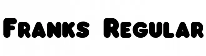
A bold, rounded font with a playful and friendly style.
![Franks Regular フリーフォントのダウンロード]() ダウンロード 3769 ダウンロード数@WebFont
ダウンロード 3769 ダウンロード数@WebFont -
( Fonts by Francis John - Francis Studio - Personal-use only. For commercial use please contact owner. )
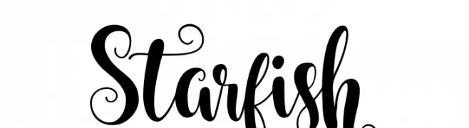
An elegant script font with ornate swirls and decorative flourishes.
![Starfish フリーフォントのダウンロード]() ダウンロード 3769 ダウンロード数@WebFont
ダウンロード 3769 ダウンロード数@WebFont -
-
( Fonts by Lecter Johnson - doubletwostudios.tumblr.com )
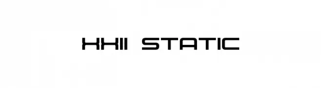
A modern, geometric font with a futuristic and clean design.
![XXII STATIC フリーフォントのダウンロード]() ダウンロード 3769 ダウンロード数@WebFont
ダウンロード 3769 ダウンロード数@WebFont -
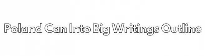
![Poland Can Into Big Writings Outline フリーフォントのダウンロード]() ダウンロード 3768 ダウンロード数@WebFont
ダウンロード 3768 ダウンロード数@WebFont -
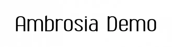
![Ambrosia Demo フリーフォントのダウンロード]() ダウンロード 3768 ダウンロード数@WebFont
ダウンロード 3768 ダウンロード数@WebFont -
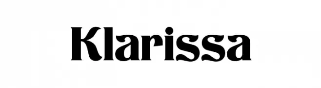
( Fonts by Dieter Steffmann )
A bold, high-contrast font with dramatic strokes and unique character design.
![Klarissa フリーフォントのダウンロード]() ダウンロード 3767 ダウンロード数@WebFont
ダウンロード 3767 ダウンロード数@WebFont -
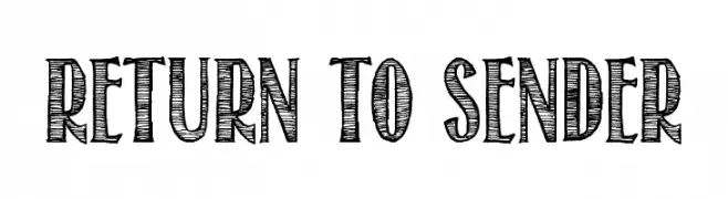
( Fonts by Tom Kolter - www.ghostsofbigfoot.com )
A bold, hand-drawn font with a textured, sketch-like appearance.
![Return To Sender フリーフォントのダウンロード]() ダウンロード 3766 ダウンロード数@WebFont
ダウンロード 3766 ダウンロード数@WebFont


今のトップフォントは?
は、クリーンな造形と広い適用範囲で支持を集めています。 ブランディングからランディングページ、ポスターまで活躍します。
ロゴで人気のフォントは?
幾何学系の サンセリフ(例: Poppins、Gotham 系のファミリー)は、スケーラブルでクリーンな印象に最適。 親しみやすさを出すなら スクリプト や手書き系も定番です。 見出しは力強く、本文はニュートラルに──この組み合わせが認知とバランスを高めます。
人気リストはどのくらいの頻度で更新される?
ダウンロード数やエンゲージメントに基づき定期的に更新します。 こまめにチェックして、次に流行るフォントを先取りしましょう。
💡 ヒント: このページをブックマークしておくと便利です。トレンドは速く、今のトップが明日のリブランディングを導くこともあります。