人気フォント セクションへようこそ。ここでは「よくダウンロードされ、よく使われている」実績ある書体をまとめています。 ロゴ、Web、SNS のどれにも使いやすい、外さない選択肢が見つかります。
どの トップフォント も、バランス・可読性・汎用性で高評価です。 モダン・サンセリフ、エレガントなスクリプト、ヴィンテージなセリフ、ミニマルなディスプレイなどを厳選しています。
-
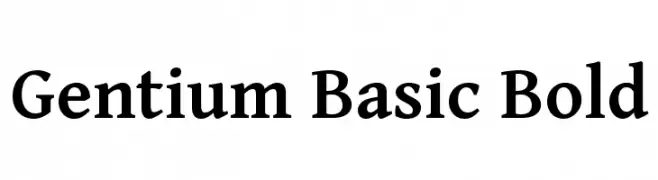
( Copyright (c) 2003-2013 SIL International (http://www.sil.org/) )
A bold serif font with classic elegance and moderate contrast.
 ダウンロード 3040 ダウンロード数@WebFont
 -
![Darbar フリーフォントのダウンロード]() ダウンロード 3039 ダウンロード数@WebFont
ダウンロード 3039 ダウンロード数@WebFont -
![Airport フリーフォントのダウンロード]() ダウンロード 3039 ダウンロード数@WebFont
ダウンロード 3039 ダウンロード数@WebFont -
![Mulan フリーフォントのダウンロード]() ダウンロード 3039 ダウンロード数@WebFont
ダウンロード 3039 ダウンロード数@WebFont -
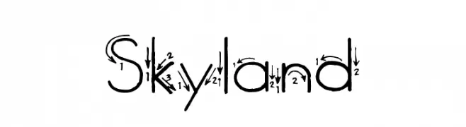
![Skyland フリーフォントのダウンロード]() ダウンロード 3038 ダウンロード数@WebFont
ダウンロード 3038 ダウンロード数@WebFont -
-
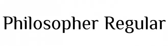
( Copyright 2011 The Philosopher Project Authors (lemonad@jovanny.ru) )
A classic serif font with elegant curves and moderate contrast, ideal for refined and readable text.
![Philosopher Regular フリーフォントのダウンロード]() ダウンロード 3037 ダウンロード数@WebFont
ダウンロード 3037 ダウンロード数@WebFont -
( Fonts by tiagopompeu.carbonmade.com - Tiago Pompeu )
A modern, rounded sans-serif font with smooth curves and a clean, approachable design.
![abipti フリーフォントのダウンロード]() ダウンロード 3037 ダウンロード数@WebFont
ダウンロード 3037 ダウンロード数@WebFont -
![Masonic Cipher & Symbols フリーフォントのダウンロード]() ダウンロード 3037 ダウンロード数@WebFont
ダウンロード 3037 ダウンロード数@WebFont -
![--flak-- フリーフォントのダウンロード]() ダウンロード 3036 ダウンロード数@WebFont
ダウンロード 3036 ダウンロード数@WebFont -
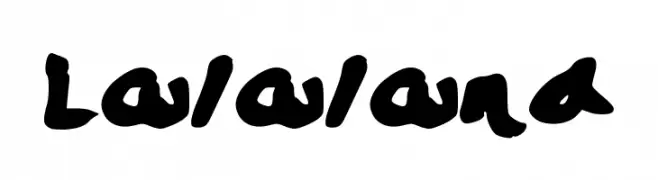
![Lalaland フリーフォントのダウンロード]() ダウンロード 3035 ダウンロード数@WebFont
ダウンロード 3035 ダウンロード数@WebFont


今のトップフォントは?
は、クリーンな造形と広い適用範囲で支持を集めています。 ブランディングからランディングページ、ポスターまで活躍します。
ロゴで人気のフォントは?
幾何学系の サンセリフ(例: Poppins、Gotham 系のファミリー)は、スケーラブルでクリーンな印象に最適。 親しみやすさを出すなら スクリプト や手書き系も定番です。 見出しは力強く、本文はニュートラルに──この組み合わせが認知とバランスを高めます。
人気リストはどのくらいの頻度で更新される?
ダウンロード数やエンゲージメントに基づき定期的に更新します。 こまめにチェックして、次に流行るフォントを先取りしましょう。
💡 ヒント: このページをブックマークしておくと便利です。トレンドは速く、今のトップが明日のリブランディングを導くこともあります。