人気フォント セクションへようこそ。ここでは「よくダウンロードされ、よく使われている」実績ある書体をまとめています。 ロゴ、Web、SNS のどれにも使いやすい、外さない選択肢が見つかります。
どの トップフォント も、バランス・可読性・汎用性で高評価です。 モダン・サンセリフ、エレガントなスクリプト、ヴィンテージなセリフ、ミニマルなディスプレイなどを厳選しています。
-
 ダウンロード 3053 ダウンロード数@WebFont
 -
![Venus-Normal フリーフォントのダウンロード]() ダウンロード 3053 ダウンロード数
ダウンロード 3053 ダウンロード数 -
![This side up フリーフォントのダウンロード]() ダウンロード 3052 ダウンロード数@WebFont
ダウンロード 3052 ダウンロード数@WebFont -
( Fonts by Arkandis Digital Foundry )
A bold, serif font with a classic and authoritative style, perfect for impactful headlines.
![TribunADFStd-BoldCond フリーフォントのダウンロード]() ダウンロード 3052 ダウンロード数@WebFont
ダウンロード 3052 ダウンロード数@WebFont -
![Lynx フリーフォントのダウンロード]() ダウンロード 3052 ダウンロード数@WebFont
ダウンロード 3052 ダウンロード数@WebFont -
-
( Fonts by Daniel Zadorozny - www.iconian.com )
A bold, decorative font with a distressed, vintage look.
![1st Cav II フリーフォントのダウンロード]() ダウンロード 3052 ダウンロード数@WebFont
ダウンロード 3052 ダウンロード数@WebFont -
( Fonts by Hubert & Fischer - Personal-use only. For commercial use please contact owner. )
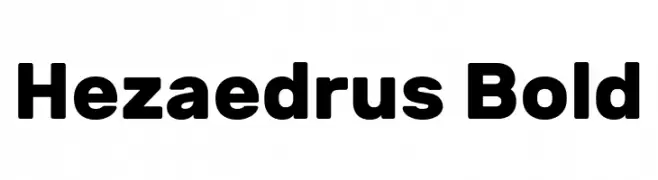
A bold, modern sans-serif typeface with strong lines and uniform width.
![Hezaedrus Bold フリーフォントのダウンロード]() ダウンロード 3051 ダウンロード数@WebFont
ダウンロード 3051 ダウンロード数@WebFont -
( Copyright (c) 2015, Cadson Demak (info@cadsondemak.com) )
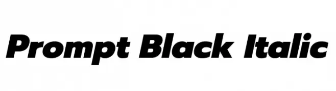
A bold, italicized font with a modern and dynamic style.
![Prompt Black Italic フリーフォントのダウンロード]() ダウンロード 3051 ダウンロード数@WebFont
ダウンロード 3051 ダウンロード数@WebFont -
( Fonts by Jacob Fisher - www.pizzadude.dk )
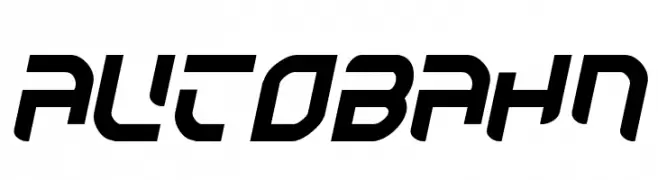
A bold, futuristic font with angular, geometric shapes and a dynamic slant.
![Autobahn フリーフォントのダウンロード]() ダウンロード 3051 ダウンロード数@WebFont
ダウンロード 3051 ダウンロード数@WebFont -
( Copyright 2011 The Alegreya Project Authors (https://github.com/huertatipografica/Alegreya) )
A bold serif font with strong contrast and classic appeal.
![Alegreya Black フリーフォントのダウンロード]() ダウンロード 3050 ダウンロード数@WebFont
ダウンロード 3050 ダウンロード数@WebFont


今のトップフォントは?
は、クリーンな造形と広い適用範囲で支持を集めています。 ブランディングからランディングページ、ポスターまで活躍します。
ロゴで人気のフォントは?
幾何学系の サンセリフ(例: Poppins、Gotham 系のファミリー)は、スケーラブルでクリーンな印象に最適。 親しみやすさを出すなら スクリプト や手書き系も定番です。 見出しは力強く、本文はニュートラルに──この組み合わせが認知とバランスを高めます。
人気リストはどのくらいの頻度で更新される?
ダウンロード数やエンゲージメントに基づき定期的に更新します。 こまめにチェックして、次に流行るフォントを先取りしましょう。
💡 ヒント: このページをブックマークしておくと便利です。トレンドは速く、今のトップが明日のリブランディングを導くこともあります。