人気フォント セクションへようこそ。ここでは「よくダウンロードされ、よく使われている」実績ある書体をまとめています。 ロゴ、Web、SNS のどれにも使いやすい、外さない選択肢が見つかります。
どの トップフォント も、バランス・可読性・汎用性で高評価です。 モダン・サンセリフ、エレガントなスクリプト、ヴィンテージなセリフ、ミニマルなディスプレイなどを厳選しています。
-
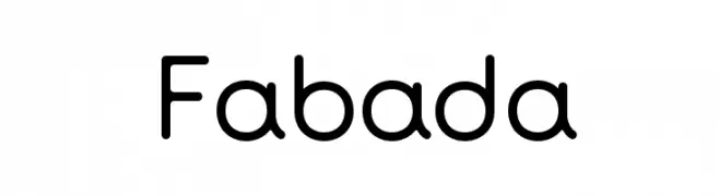
( Fonts by Fernando Haro - defharo.com )
A modern sans-serif font with rounded edges and uniform stroke width.
 ダウンロード 2819 ダウンロード数@WebFont
 -
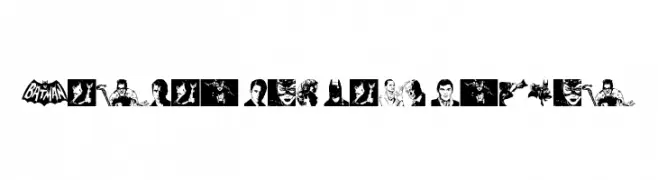
( Fonts by Daniel Zadorozny - www.iconian.com - Free for personal use )
A 3D outline font with geometric precision and modern appeal.
![Concielian 3D フリーフォントのダウンロード]() ダウンロード 2819 ダウンロード数@WebFont
ダウンロード 2819 ダウンロード数@WebFont -
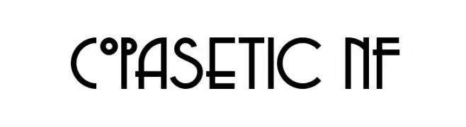
( Fonts by Nick Curtis - www.nicksfonts.com )
A geometric, art deco-inspired font with bold, angular lines and sharp edges.
![Copasetic NF フリーフォントのダウンロード]() ダウンロード 2818 ダウンロード数@WebFont
ダウンロード 2818 ダウンロード数@WebFont -
![Batman The Dark Knight フリーフォントのダウンロード]() ダウンロード 2817 ダウンロード数@WebFont
ダウンロード 2817 ダウンロード数@WebFont -
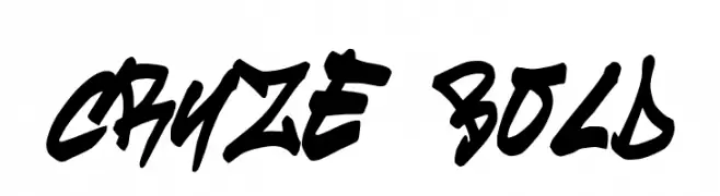
![cruze Bold フリーフォントのダウンロード]() ダウンロード 2817 ダウンロード数@WebFont
ダウンロード 2817 ダウンロード数@WebFont -
-
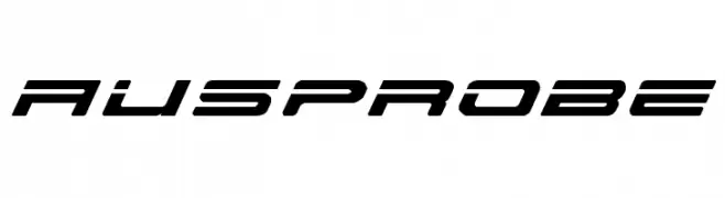
![AusPROBE フリーフォントのダウンロード]() ダウンロード 2817 ダウンロード数@WebFont
ダウンロード 2817 ダウンロード数@WebFont -
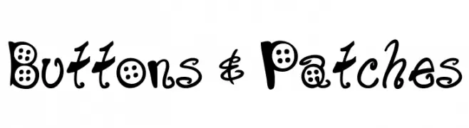
![Buttons & Patches フリーフォントのダウンロード]() ダウンロード 2817 ダウンロード数@WebFont
ダウンロード 2817 ダウンロード数@WebFont -
( Fonts by Dieter Schumacher )
A bold, playful font with thick, rounded strokes and a hand-drawn appearance.
![309 フリーフォントのダウンロード]() ダウンロード 2817 ダウンロード数@WebFont
ダウンロード 2817 ダウンロード数@WebFont -
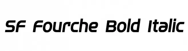
![SF Fourche Bold Italic フリーフォントのダウンロード]() ダウンロード 2816 ダウンロード数@WebFont
ダウンロード 2816 ダウンロード数@WebFont -
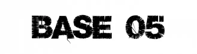
( Fonts by a Clement Nicolle - www.stereo-type.fr . Personal-use only. For commercial use please contact owner. )
A bold, textured font with a brush stroke effect, ideal for impactful designs.
![Base 05 フリーフォントのダウンロード]() ダウンロード 2815 ダウンロード数@WebFont
ダウンロード 2815 ダウンロード数@WebFont


今のトップフォントは?
は、クリーンな造形と広い適用範囲で支持を集めています。 ブランディングからランディングページ、ポスターまで活躍します。
ロゴで人気のフォントは?
幾何学系の サンセリフ(例: Poppins、Gotham 系のファミリー)は、スケーラブルでクリーンな印象に最適。 親しみやすさを出すなら スクリプト や手書き系も定番です。 見出しは力強く、本文はニュートラルに──この組み合わせが認知とバランスを高めます。
人気リストはどのくらいの頻度で更新される?
ダウンロード数やエンゲージメントに基づき定期的に更新します。 こまめにチェックして、次に流行るフォントを先取りしましょう。
💡 ヒント: このページをブックマークしておくと便利です。トレンドは速く、今のトップが明日のリブランディングを導くこともあります。