人気フォント セクションへようこそ。ここでは「よくダウンロードされ、よく使われている」実績ある書体をまとめています。 ロゴ、Web、SNS のどれにも使いやすい、外さない選択肢が見つかります。
どの トップフォント も、バランス・可読性・汎用性で高評価です。 モダン・サンセリフ、エレガントなスクリプト、ヴィンテージなセリフ、ミニマルなディスプレイなどを厳選しています。
-
 ダウンロード 2726 ダウンロード数@WebFont
 -
( Fonts by Castcraft Software - opti.netii.net - check the website before use )
A bold, modern font with thick strokes and geometric shapes.
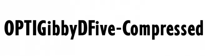
![OPTIGibbyDFive-Compressed フリーフォントのダウンロード]() ダウンロード 2726 ダウンロード数@WebFont
ダウンロード 2726 ダウンロード数@WebFont -
( Fonts by Castcraft Software - opti.netii.net - check the website before use )
A bold, elegant font with tall, narrow characters and high contrast strokes.
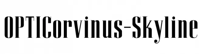
![OPTICorvinus-Skyline フリーフォントのダウンロード]() ダウンロード 2726 ダウンロード数@WebFont
ダウンロード 2726 ダウンロード数@WebFont -
( Fonts by Kreative Korporation - www.kreativekorp.com )
A bold, hand-drawn font with a rough, graffiti-like style.
![Felicia フリーフォントのダウンロード]() ダウンロード 2726 ダウンロード数@WebFont
ダウンロード 2726 ダウンロード数@WebFont -
( Fonts by Castcraft Software - opti.netii.net - check the website before use )
A bold, geometric font with a futuristic and modern design.
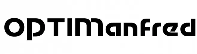
![OPTIManfred フリーフォントのダウンロード]() ダウンロード 2725 ダウンロード数@WebFont
ダウンロード 2725 ダウンロード数@WebFont -
-
( Font by Jayvee D. Enaguas - grandchaos9000.deviantart.com )
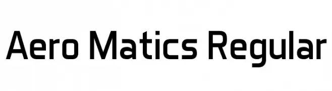
A modern, geometric sans-serif font with clean lines and balanced proportions.
![Aero Matics Regular フリーフォントのダウンロード]() ダウンロード 2725 ダウンロード数@WebFont
ダウンロード 2725 ダウンロード数@WebFont -
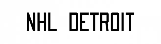
![NHL Detroit フリーフォントのダウンロード]() ダウンロード 2725 ダウンロード数@WebFont
ダウンロード 2725 ダウンロード数@WebFont -
( Fonts by dartcanada.tripod.com - Darren Rigby )
A modern, geometric sans-serif font with clean lines and uniform structure.
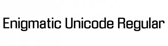
![Enigmatic Unicode Regular フリーフォントのダウンロード]() ダウンロード 2725 ダウンロード数
ダウンロード 2725 ダウンロード数 -
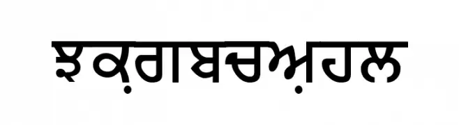
![Merapunjab フリーフォントのダウンロード]() ダウンロード 2725 ダウンロード数@WebFont
ダウンロード 2725 ダウンロード数@WebFont -
( Fonts by ShyFonts )
A futuristic, geometric font with bold, blocky letterforms and consistent stroke width.
![SF Automaton フリーフォントのダウンロード]() ダウンロード 2725 ダウンロード数@WebFont
ダウンロード 2725 ダウンロード数@WebFont

今のトップフォントは?
は、クリーンな造形と広い適用範囲で支持を集めています。 ブランディングからランディングページ、ポスターまで活躍します。
ロゴで人気のフォントは?
幾何学系の サンセリフ(例: Poppins、Gotham 系のファミリー)は、スケーラブルでクリーンな印象に最適。 親しみやすさを出すなら スクリプト や手書き系も定番です。 見出しは力強く、本文はニュートラルに──この組み合わせが認知とバランスを高めます。
人気リストはどのくらいの頻度で更新される?
ダウンロード数やエンゲージメントに基づき定期的に更新します。 こまめにチェックして、次に流行るフォントを先取りしましょう。
💡 ヒント: このページをブックマークしておくと便利です。トレンドは速く、今のトップが明日のリブランディングを導くこともあります。