人気フォント セクションへようこそ。ここでは「よくダウンロードされ、よく使われている」実績ある書体をまとめています。 ロゴ、Web、SNS のどれにも使いやすい、外さない選択肢が見つかります。
どの トップフォント も、バランス・可読性・汎用性で高評価です。 モダン・サンセリフ、エレガントなスクリプト、ヴィンテージなセリフ、ミニマルなディスプレイなどを厳選しています。
-
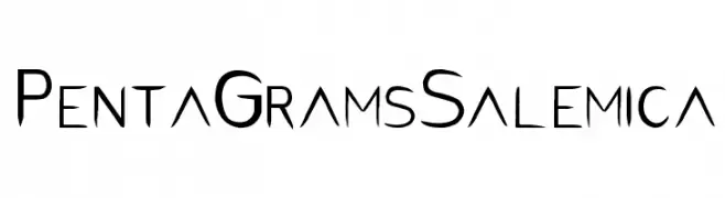
( FULL MOON Design House™ - Penta Gram - en.fmdh.rs )
An artistic, angular font with a gothic flair, perfect for dramatic designs.
 ダウンロード 2721 ダウンロード数@WebFont
 -
( Please check the owner website: http://www.billie.grosse.is-a-geek.com )
A bold, expressive script font with a marker-like, handwritten style.
![GHW Dukandar Marker フリーフォントのダウンロード]() ダウンロード 2721 ダウンロード数@WebFont
ダウンロード 2721 ダウンロード数@WebFont -
( Fonts by Syaf Rizal - www.creativefabrica.com/ref/53/ - Personal-use only. For commercial use please contact owner. )
A bold, playful handwritten font with rounded, smooth letterforms.
![Males フリーフォントのダウンロード]() ダウンロード 2720 ダウンロード数@WebFont
ダウンロード 2720 ダウンロード数@WebFont -
( Copyright (c) 2015, Christian Thalmann and the Cormorant Project Authors (github.com/CatharsisFonts/Cormorant) )
An elegant serif font with a classic italic style and moderate contrast.
![Cormorant Italic フリーフォントのダウンロード]() ダウンロード 2720 ダウンロード数@WebFont
ダウンロード 2720 ダウンロード数@WebFont -
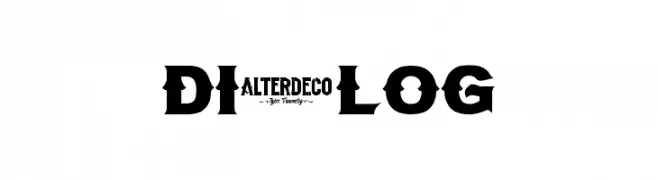
( Fonts by a AlterDeco Type Foundry - Adit Saputra. Personal-use only. For commercial use please contact owner. )
A bold, geometric font with Art Deco influences, perfect for striking headlines and logos.
![Dialog フリーフォントのダウンロード]() ダウンロード 2720 ダウンロード数@WebFont
ダウンロード 2720 ダウンロード数@WebFont -
-
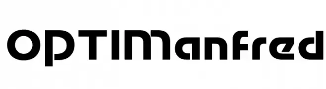
( Fonts by Castcraft Software - opti.netii.net - check the website before use )
A bold, geometric font with a futuristic and modern design.
![OPTIManfred フリーフォントのダウンロード]() ダウンロード 2720 ダウンロード数@WebFont
ダウンロード 2720 ダウンロード数@WebFont -
( Copyright (c) 2011 by Anna GiedryÅ› (http://ancymonic.com) )
A bold, modern sans-serif font with excellent legibility and a slightly condensed style.
![Signika Negative Bold フリーフォントのダウンロード]() ダウンロード 2720 ダウンロード数@WebFont
ダウンロード 2720 ダウンロード数@WebFont -
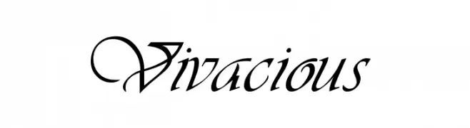
![Vivacious フリーフォントのダウンロード]() ダウンロード 2720 ダウンロード数
ダウンロード 2720 ダウンロード数 -
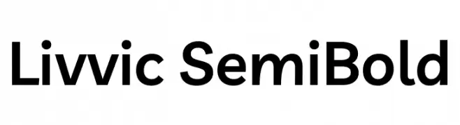
( Copyright 2019 The Livvic Project Authors (https://github.com/Fonthausen/Livvic) )
A modern, semi-bold sans-serif typeface with clean lines and balanced proportions.
![Livvic SemiBold フリーフォントのダウンロード]() ダウンロード 2719 ダウンロード数@WebFont
ダウンロード 2719 ダウンロード数@WebFont -
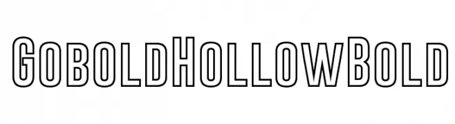
( Fonts by a Situjuh Nazara - c7n1.wordpress.com. Personal-use only. For commercial use please contact owner. )
A bold, hollow font with geometric lines and a modern, structured appearance.
![Gobold Hollow Bold フリーフォントのダウンロード]() ダウンロード 2719 ダウンロード数@WebFont
ダウンロード 2719 ダウンロード数@WebFont


今のトップフォントは?
は、クリーンな造形と広い適用範囲で支持を集めています。 ブランディングからランディングページ、ポスターまで活躍します。
ロゴで人気のフォントは?
幾何学系の サンセリフ(例: Poppins、Gotham 系のファミリー)は、スケーラブルでクリーンな印象に最適。 親しみやすさを出すなら スクリプト や手書き系も定番です。 見出しは力強く、本文はニュートラルに──この組み合わせが認知とバランスを高めます。
人気リストはどのくらいの頻度で更新される?
ダウンロード数やエンゲージメントに基づき定期的に更新します。 こまめにチェックして、次に流行るフォントを先取りしましょう。
💡 ヒント: このページをブックマークしておくと便利です。トレンドは速く、今のトップが明日のリブランディングを導くこともあります。