人気フォント セクションへようこそ。ここでは「よくダウンロードされ、よく使われている」実績ある書体をまとめています。 ロゴ、Web、SNS のどれにも使いやすい、外さない選択肢が見つかります。
どの トップフォント も、バランス・可読性・汎用性で高評価です。 モダン・サンセリフ、エレガントなスクリプト、ヴィンテージなセリフ、ミニマルなディスプレイなどを厳選しています。
-
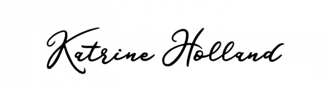
( Fonts by Tan Cundrawan - cove703 - creativemarket.com/cove703 - Personal-use only. For commercial use please contact owner. )
An elegant cursive font with flowing, graceful lines.
 ダウンロード 109 ダウンロード数@WebFont
 -
( Fonts by JOEBOB graphics - Joe vanderHam - Personal-use only. For commercial use please contact owner. )
A fluid and elegant handwritten script font with smooth, connected strokes.
![Epistula Regular TRIAL フリーフォントのダウンロード]() ダウンロード 109 ダウンロード数@WebFont
ダウンロード 109 ダウンロード数@WebFont -
( Fonts by www.houseoflime.com )
A bold, framed font with geometric, monospaced characters.
![Framed フリーフォントのダウンロード]() ダウンロード 109 ダウンロード数@WebFont
ダウンロード 109 ダウンロード数@WebFont -
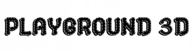
( Fonts by Daddi Daryawan )
A playful, 3D font with a dotted outline and rounded characters.
![PLAYGROUND 3D フリーフォントのダウンロード]() ダウンロード 109 ダウンロード数@WebFont
ダウンロード 109 ダウンロード数@WebFont -
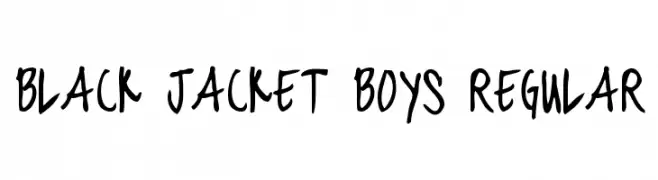
( Fonts by Chris Vile - fontmonger.com - Personal-use only. For commercial use please contact owner. )
A bold, handwritten font with a playful and energetic style.
![black jacket boys Regular フリーフォントのダウンロード]() ダウンロード 109 ダウンロード数@WebFont
ダウンロード 109 ダウンロード数@WebFont -
-
( Fonts by Daniel Zadorozny - www.iconian.com )
A futuristic, condensed italic font with sharp, angular edges.
![QuickGear Condensed Italic フリーフォントのダウンロード]() ダウンロード 109 ダウンロード数@WebFont
ダウンロード 109 ダウンロード数@WebFont -
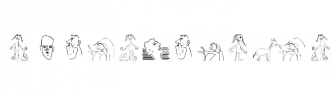
( Fonts by Manfred Klein. Free for private and charity use. Free for commercial with donation to organizations )
A collection of whimsical sketched illustrations in place of traditional characters.
![SketchedBats フリーフォントのダウンロード]() ダウンロード 109 ダウンロード数@WebFont
ダウンロード 109 ダウンロード数@WebFont -
( Evad - Dave Huizing )
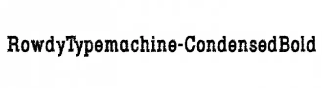
A bold, condensed font with a rugged, textured appearance.
![RowdyTypemachine-CondensedBold フリーフォントのダウンロード]() ダウンロード 109 ダウンロード数@WebFont
ダウンロード 109 ダウンロード数@WebFont -
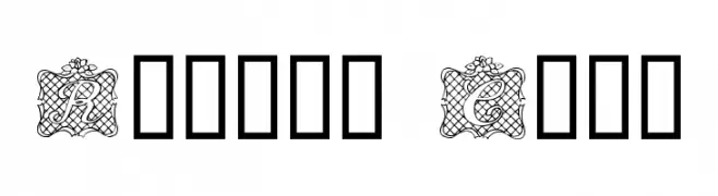
( Fonts by www.houseoflime.com )
An ornate, decorative font with ribbon-like designs and framed uppercase letters.
![Ribbon Caps フリーフォントのダウンロード]() ダウンロード 109 ダウンロード数@WebFont
ダウンロード 109 ダウンロード数@WebFont -
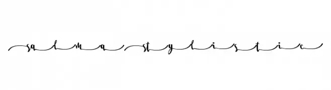
( Fonts by MissinkLab Studio - creativemarket.com/Missinklabstudio - Personal-use only. For commercial use please contact owner. )
An elegant, flowing script font with intricate, connected letterforms.
![Salma Stylistic 5 フリーフォントのダウンロード]() ダウンロード 109 ダウンロード数@WebFont
ダウンロード 109 ダウンロード数@WebFont


今のトップフォントは?
は、クリーンな造形と広い適用範囲で支持を集めています。 ブランディングからランディングページ、ポスターまで活躍します。
ロゴで人気のフォントは?
幾何学系の サンセリフ(例: Poppins、Gotham 系のファミリー)は、スケーラブルでクリーンな印象に最適。 親しみやすさを出すなら スクリプト や手書き系も定番です。 見出しは力強く、本文はニュートラルに──この組み合わせが認知とバランスを高めます。
人気リストはどのくらいの頻度で更新される?
ダウンロード数やエンゲージメントに基づき定期的に更新します。 こまめにチェックして、次に流行るフォントを先取りしましょう。
💡 ヒント: このページをブックマークしておくと便利です。トレンドは速く、今のトップが明日のリブランディングを導くこともあります。