人気フォント セクションへようこそ。ここでは「よくダウンロードされ、よく使われている」実績ある書体をまとめています。 ロゴ、Web、SNS のどれにも使いやすい、外さない選択肢が見つかります。
どの トップフォント も、バランス・可読性・汎用性で高評価です。 モダン・サンセリフ、エレガントなスクリプト、ヴィンテージなセリフ、ミニマルなディスプレイなどを厳選しています。
-
 ダウンロード 108 ダウンロード数@WebFont
 -
( Fonts by Manfred Klein. Free for private and charity use. Free for commercial with donation to organizations )
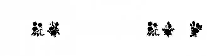
An artistic font featuring abstract, surrealist line drawings within each character.
![SketchesOfSpain フリーフォントのダウンロード]() ダウンロード 108 ダウンロード数@WebFont
ダウンロード 108 ダウンロード数@WebFont -
![YOzFontEP97 Italic フリーフォントのダウンロード]() ダウンロード 108 ダウンロード数@WebFont
ダウンロード 108 ダウンロード数@WebFont -
( Fonts by Manfred Klein. Free for private and charity use. Free for commercial with donation to organizations )
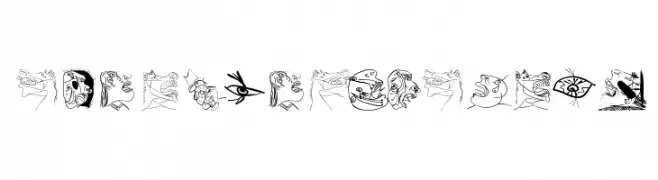
Cartoonish, illustrated font with each character as a unique drawing.
![StrangersInTheDays フリーフォントのダウンロード]() ダウンロード 108 ダウンロード数@WebFont
ダウンロード 108 ダウンロード数@WebFont -
( Fonts by Daniel Zadorozny - www.iconian.com - Personal-use only. For commercial use please contact owner. )
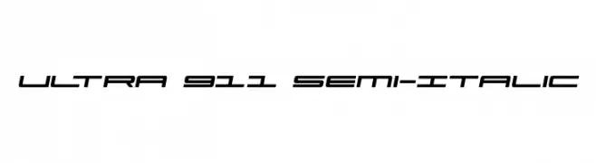
A sleek, futuristic font with a semi-italic slant and consistent stroke thickness.
![Ultra 911 Semi-Italic フリーフォントのダウンロード]() ダウンロード 108 ダウンロード数@WebFont
ダウンロード 108 ダウンロード数@WebFont -
-
( Fonts by Manfred Klein. Free for private and charity use. Free for commercial with donation to organizations )
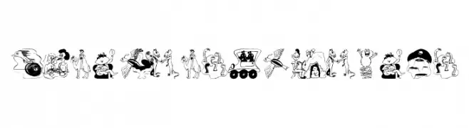
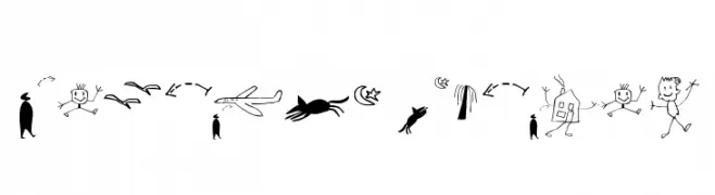
A quirky, illustrated font made up of hand-drawn doodles and stick figures.
![Laurens Normal フリーフォントのダウンロード]() ダウンロード 108 ダウンロード数@WebFont
ダウンロード 108 ダウンロード数@WebFont -
( Fonts by Billy Argel Fonts - www.billyargel.com - Personal-use only. For commercial use please contact owner. )
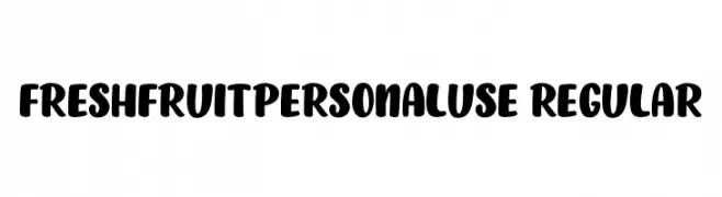
A bold, playful font with rounded, smooth letterforms and wide spacing.
![FRESHFRUITPERSONALUSE-Regular フリーフォントのダウンロード]() ダウンロード 108 ダウンロード数@WebFont
ダウンロード 108 ダウンロード数@WebFont -
( Fonts by Hilary B )
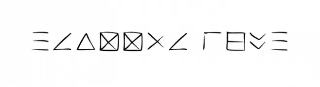
A geometric and abstract font with non-traditional characters.
![Transcription Regular フリーフォントのダウンロード]() ダウンロード 108 ダウンロード数@WebFont
ダウンロード 108 ダウンロード数@WebFont -
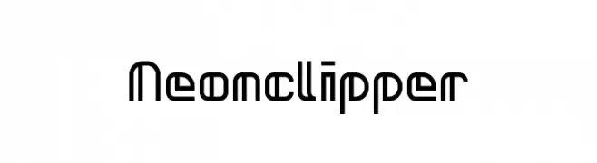
![Neonclipper フリーフォントのダウンロード]() ダウンロード 108 ダウンロード数@WebFont
ダウンロード 108 ダウンロード数@WebFont -
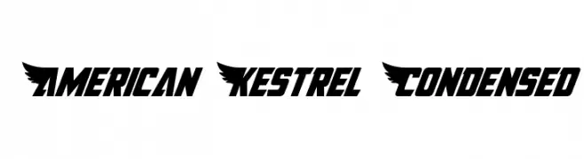
![American Kestrel Condensed フリーフォントのダウンロード]() ダウンロード 108 ダウンロード数@WebFont
ダウンロード 108 ダウンロード数@WebFont
今のトップフォントは?
は、クリーンな造形と広い適用範囲で支持を集めています。 ブランディングからランディングページ、ポスターまで活躍します。
ロゴで人気のフォントは?
幾何学系の サンセリフ(例: Poppins、Gotham 系のファミリー)は、スケーラブルでクリーンな印象に最適。 親しみやすさを出すなら スクリプト や手書き系も定番です。 見出しは力強く、本文はニュートラルに──この組み合わせが認知とバランスを高めます。
人気リストはどのくらいの頻度で更新される?
ダウンロード数やエンゲージメントに基づき定期的に更新します。 こまめにチェックして、次に流行るフォントを先取りしましょう。
💡 ヒント: このページをブックマークしておくと便利です。トレンドは速く、今のトップが明日のリブランディングを導くこともあります。