人気フォント セクションへようこそ。ここでは「よくダウンロードされ、よく使われている」実績ある書体をまとめています。 ロゴ、Web、SNS のどれにも使いやすい、外さない選択肢が見つかります。
どの トップフォント も、バランス・可読性・汎用性で高評価です。 モダン・サンセリフ、エレガントなスクリプト、ヴィンテージなセリフ、ミニマルなディスプレイなどを厳選しています。
-
( Fonts by www.alphabetype.it )
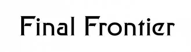
A futuristic, angular font with sharp edges and geometric shapes.
 ダウンロード 2528 ダウンロード数@WebFont
 -
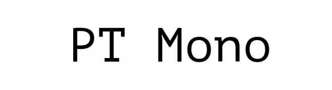
( Copyright (c) 2011, ParaType Ltd. (http://www.paratype.com/public) )
A clean, modern monospaced font with uniform character width and geometric design.
![PT Mono フリーフォントのダウンロード]() ダウンロード 2527 ダウンロード数@WebFont
ダウンロード 2527 ダウンロード数@WebFont -
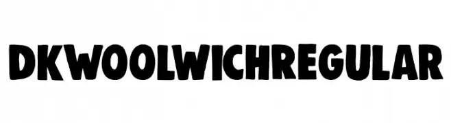
![DK Woolwich Regular フリーフォントのダウンロード]() ダウンロード 2526 ダウンロード数@WebFont
ダウンロード 2526 ダウンロード数@WebFont -
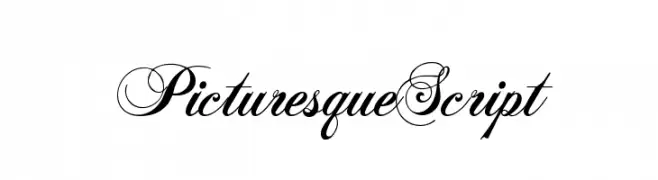
( Fonts by Castcraft Software - OPTI Fonts Archive - opti.netii.net - Personal-use only. For commercial use please contact owner. )
An elegant script font with intricate swashes and high contrast, perfect for luxurious and formal designs.
![PicturesqueScript フリーフォントのダウンロード]() ダウンロード 2526 ダウンロード数@WebFont
ダウンロード 2526 ダウンロード数@WebFont -
( Fonts by Khurasan )
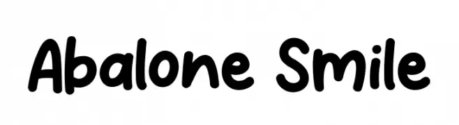
A playful, rounded font with a hand-drawn, whimsical style.
![Abalone Smile フリーフォントのダウンロード]() ダウンロード 2525 ダウンロード数@WebFont
ダウンロード 2525 ダウンロード数@WebFont -
-
( Fonts by Szabina Korsos )
A bold, playful handwritten font with thick strokes and a whimsical style.
![Erlan フリーフォントのダウンロード]() ダウンロード 2525 ダウンロード数@WebFont
ダウンロード 2525 ダウンロード数@WebFont -
( Fonts by Burim Loshaj )
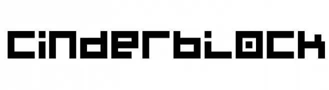
A bold, geometric font with a pixelated, digital appearance.
![Cinderblock フリーフォントのダウンロード]() ダウンロード 2525 ダウンロード数@WebFont
ダウンロード 2525 ダウンロード数@WebFont -
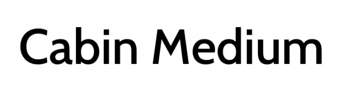
( Copyright 2016 The Cabin Project Authors (impallari@gmail.com) )
A clean, modern sans-serif typeface with balanced proportions and medium weight.
![Cabin Medium フリーフォントのダウンロード]() ダウンロード 2523 ダウンロード数@WebFont
ダウンロード 2523 ダウンロード数@WebFont -
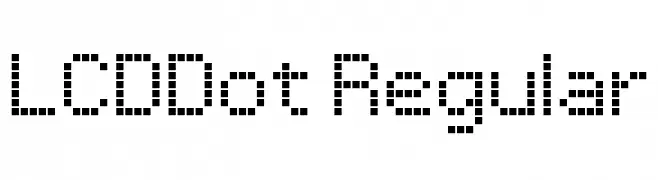
![LCDDot Regular フリーフォントのダウンロード]() ダウンロード 2523 ダウンロード数@WebFont
ダウンロード 2523 ダウンロード数@WebFont -
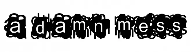
( Fonts by www.lifewithouttaffy.com )
A chaotic, overlapping font with heavily obscured characters.
![A Damn Mess フリーフォントのダウンロード]() ダウンロード 2523 ダウンロード数@WebFont
ダウンロード 2523 ダウンロード数@WebFont

今のトップフォントは?
は、クリーンな造形と広い適用範囲で支持を集めています。 ブランディングからランディングページ、ポスターまで活躍します。
ロゴで人気のフォントは?
幾何学系の サンセリフ(例: Poppins、Gotham 系のファミリー)は、スケーラブルでクリーンな印象に最適。 親しみやすさを出すなら スクリプト や手書き系も定番です。 見出しは力強く、本文はニュートラルに──この組み合わせが認知とバランスを高めます。
人気リストはどのくらいの頻度で更新される?
ダウンロード数やエンゲージメントに基づき定期的に更新します。 こまめにチェックして、次に流行るフォントを先取りしましょう。
💡 ヒント: このページをブックマークしておくと便利です。トレンドは速く、今のトップが明日のリブランディングを導くこともあります。