人気フォント セクションへようこそ。ここでは「よくダウンロードされ、よく使われている」実績ある書体をまとめています。 ロゴ、Web、SNS のどれにも使いやすい、外さない選択肢が見つかります。
どの トップフォント も、バランス・可読性・汎用性で高評価です。 モダン・サンセリフ、エレガントなスクリプト、ヴィンテージなセリフ、ミニマルなディスプレイなどを厳選しています。
-
( Fonts by Alan Carr )
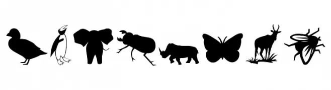
Animal silhouette icons form each character in a bold, decorative style.
 ダウンロード 2512 ダウンロード数@WebFont
 -
( Fonts by Alex Slobzheninov - Personal-use only. For commercial use please contact owner. )
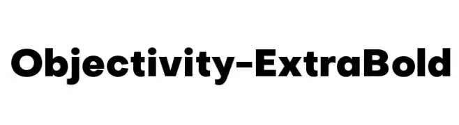
A bold, modern typeface with thick strokes and clean lines.
![Objectivity-ExtraBold フリーフォントのダウンロード]() ダウンロード 2511 ダウンロード数@WebFont
ダウンロード 2511 ダウンロード数@WebFont -
![Argor Flahm Scaqh フリーフォントのダウンロード]() ダウンロード 2511 ダウンロード数@WebFont
ダウンロード 2511 ダウンロード数@WebFont -
( Fonts by BLKBK Fonts OFF SITE )
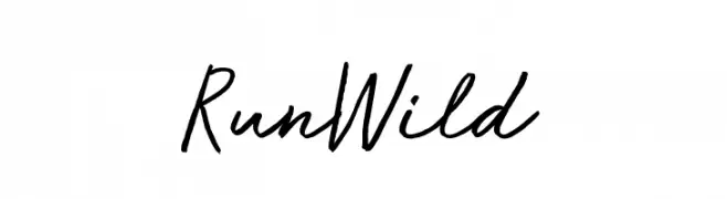
A lively and fluid handwritten font with a natural, spontaneous style.
![Run Wild フリーフォントのダウンロード]() ダウンロード 2510 ダウンロード数
ダウンロード 2510 ダウンロード数 -
( www.tomtor.com )
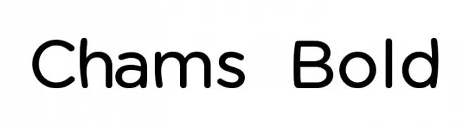
A modern, rounded font with a friendly and approachable style.
![Chams Bold フリーフォントのダウンロード]() ダウンロード 2510 ダウンロード数@WebFont
ダウンロード 2510 ダウンロード数@WebFont -
-
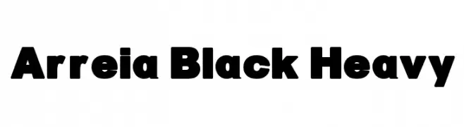
![Arreia Black Heavy フリーフォントのダウンロード]() ダウンロード 2510 ダウンロード数@WebFont
ダウンロード 2510 ダウンロード数@WebFont -
( Fonts by Sacred Nipple - Brode Vosloo )
A bold, modern font with geometric and sleek design elements.
![Fuel フリーフォントのダウンロード]() ダウンロード 2510 ダウンロード数@WebFont
ダウンロード 2510 ダウンロード数@WebFont -
( Fonts by a Youssef Habchi - youssef-habchi.com. Personal-use only. For commercial use please contact owner. )
An elegant script font with flowing, interconnected strokes and a graceful appearance.
![DistantStroke フリーフォントのダウンロード]() ダウンロード 2509 ダウンロード数@WebFont
ダウンロード 2509 ダウンロード数@WebFont -
( Fonts by Glyphobet Font Foundry - Matt Chisholm - http://glyphobet.net/typography/ )
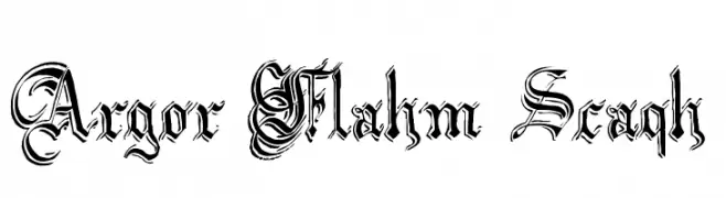
A bold, angular font with a modern twist on Gothic style, featuring high contrast and sharp edges.
![Shark フリーフォントのダウンロード]() ダウンロード 2509 ダウンロード数@WebFont
ダウンロード 2509 ダウンロード数@WebFont -
![04b_19 フリーフォントのダウンロード]() ダウンロード 2509 ダウンロード数@WebFont
ダウンロード 2509 ダウンロード数@WebFont


今のトップフォントは?
は、クリーンな造形と広い適用範囲で支持を集めています。 ブランディングからランディングページ、ポスターまで活躍します。
ロゴで人気のフォントは?
幾何学系の サンセリフ(例: Poppins、Gotham 系のファミリー)は、スケーラブルでクリーンな印象に最適。 親しみやすさを出すなら スクリプト や手書き系も定番です。 見出しは力強く、本文はニュートラルに──この組み合わせが認知とバランスを高めます。
人気リストはどのくらいの頻度で更新される?
ダウンロード数やエンゲージメントに基づき定期的に更新します。 こまめにチェックして、次に流行るフォントを先取りしましょう。
💡 ヒント: このページをブックマークしておくと便利です。トレンドは速く、今のトップが明日のリブランディングを導くこともあります。